CREATIVE DIRECTION • BRAND IDENTITY
vapen cannabis
When I joined Vapen, the only brand asset they had was a logo. I left having built a full brand identity, a creative team, a sub-brand, and a sold out campaign.

-
my role
Creative Director
-
starting point
A logo. Nothing else.
-
output
Brand system, team, sub-brand
brand identity
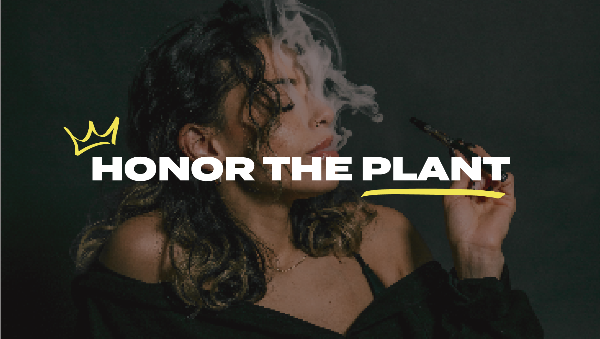
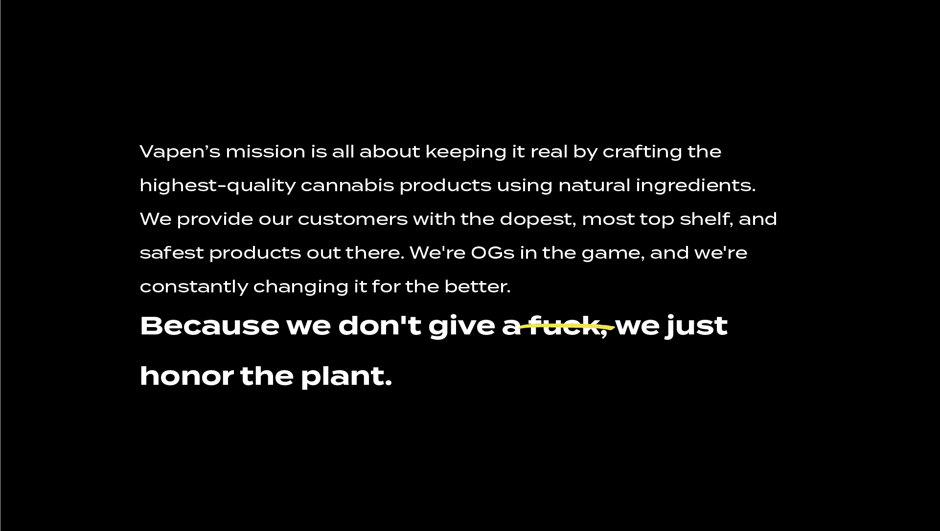
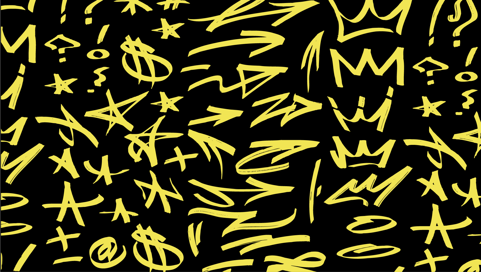
Starting from a single logo, I developed Vapen's complete brand identity — visual system, brand guidelines, tagline, iconography, and tone of voice. The starting point was a simple question: what does it mean to honor the plant? The answer shaped everything — a brand that felt as real and uncompromising as the product itself.
"Because we don't give a f*ck, we just honor the plant."


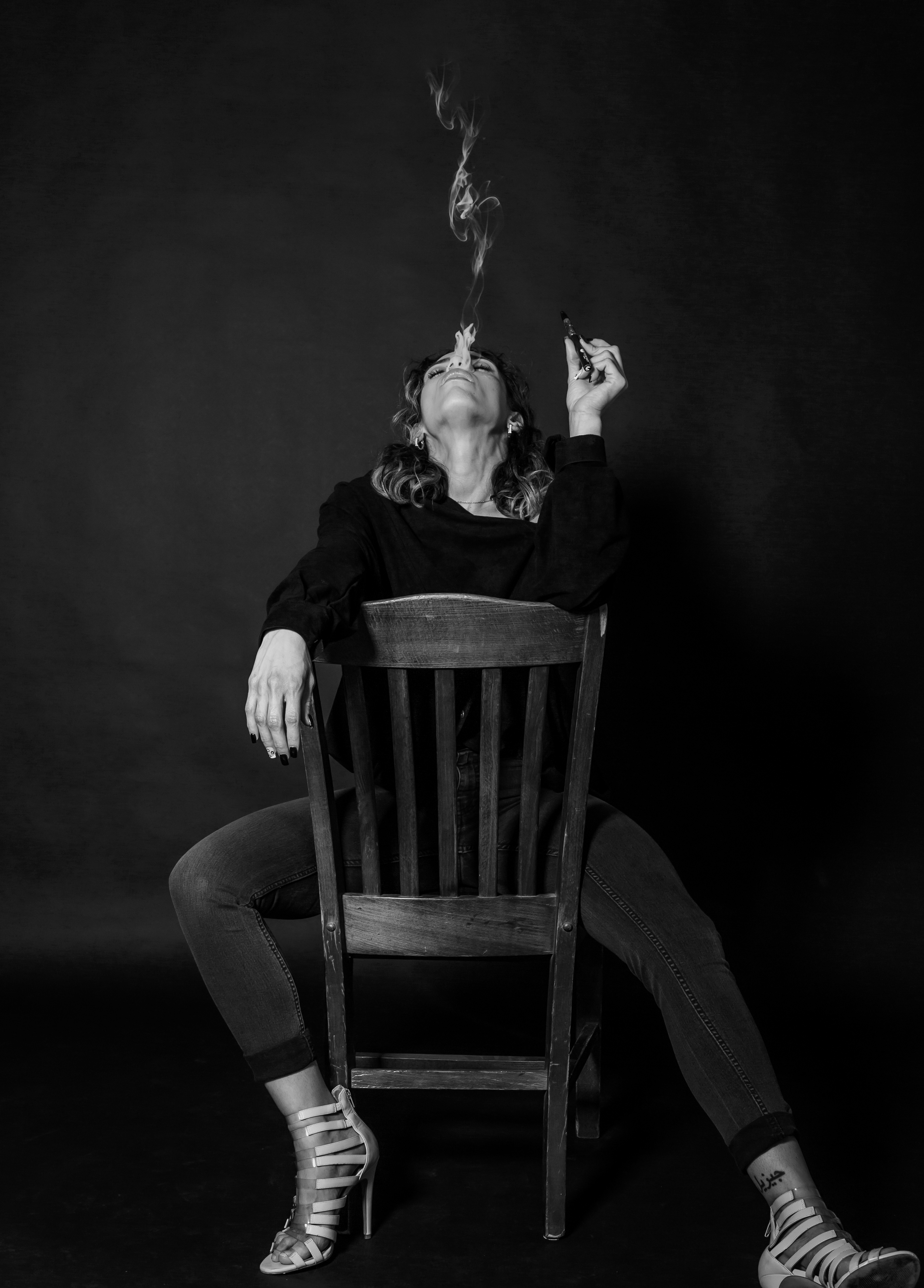
art direction
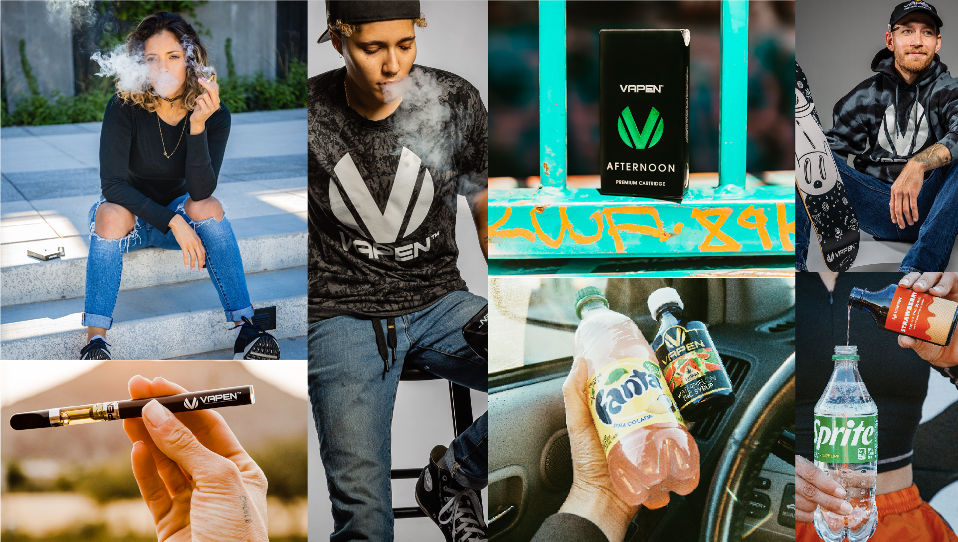
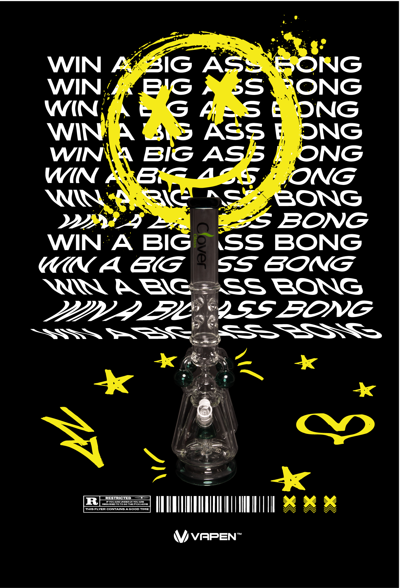
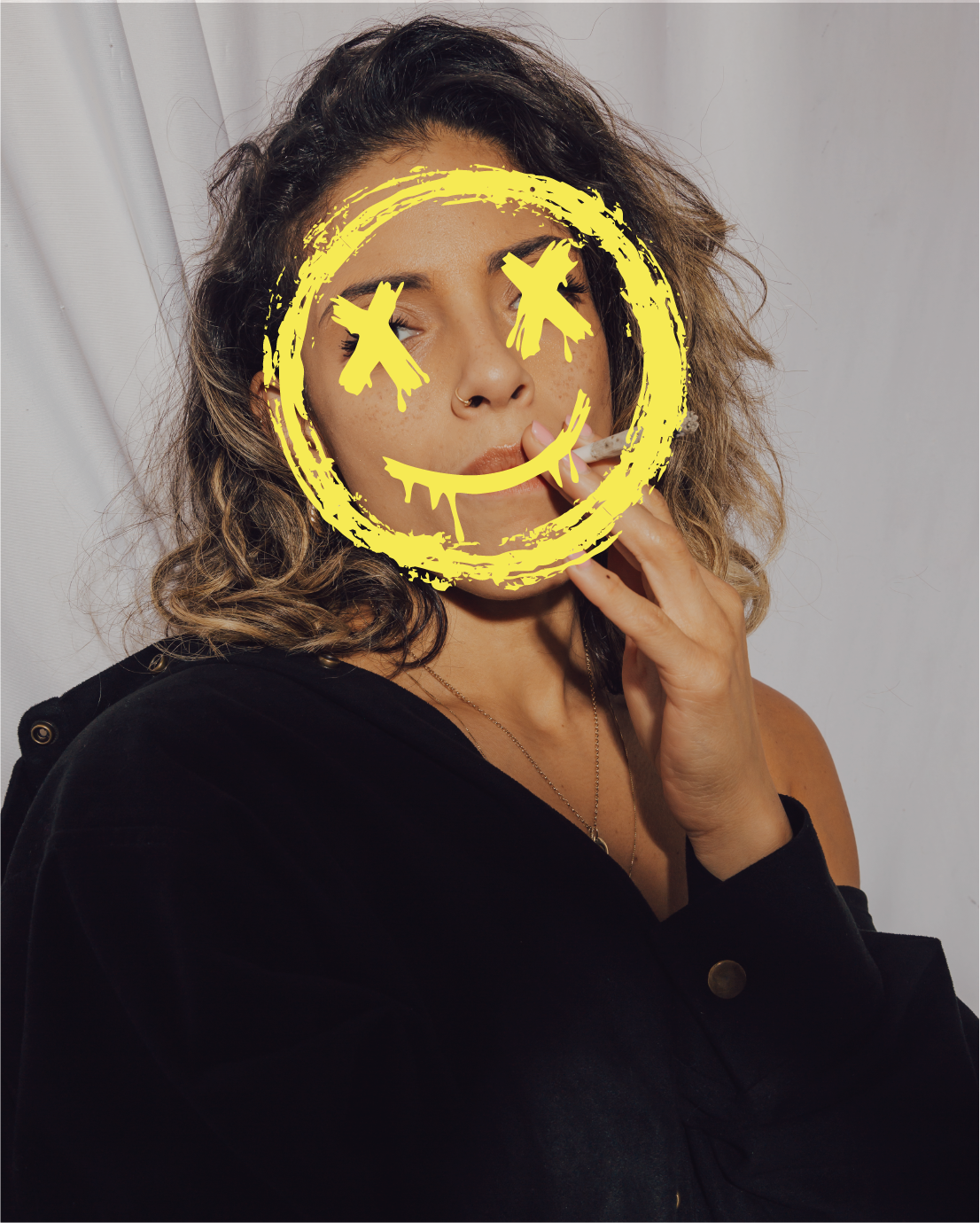
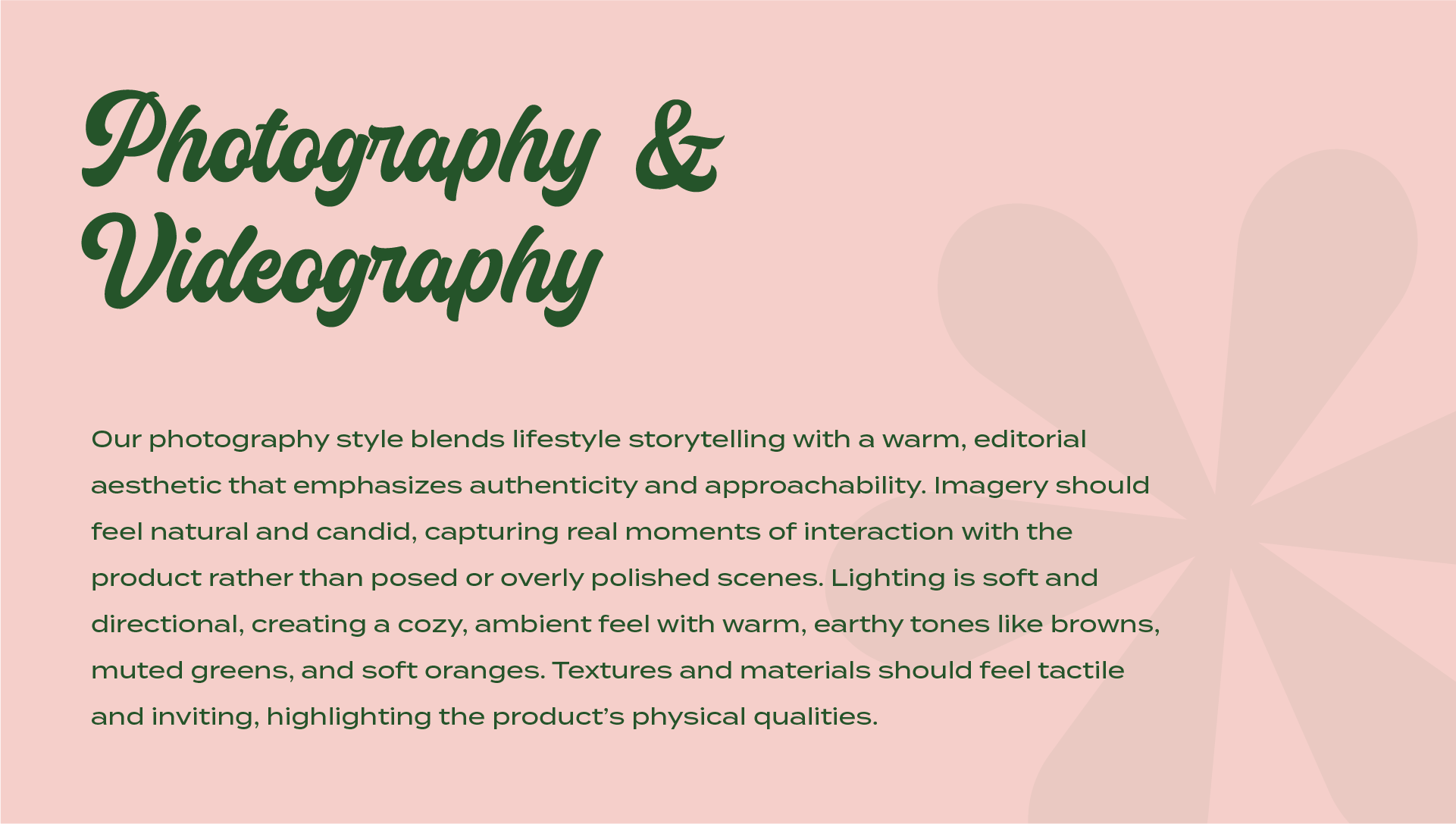
The visual style I developed for Vapen had to do something most cannabis brands weren't doing — feel real. Not polished, not corporate, not aspirational in a generic way. Real people, real culture, raw energy. I defined the graphic language, the photography and videography direction, and the overall aesthetic that made Vapen recognizable across every channel.

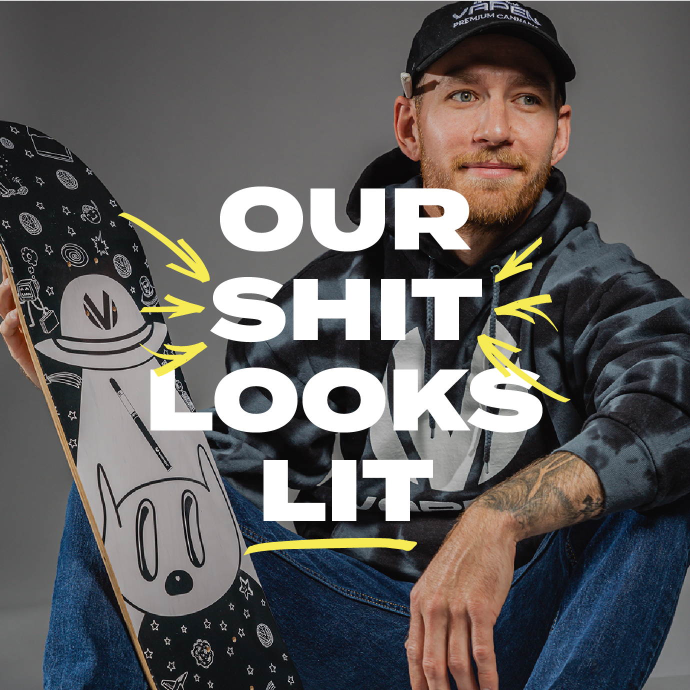


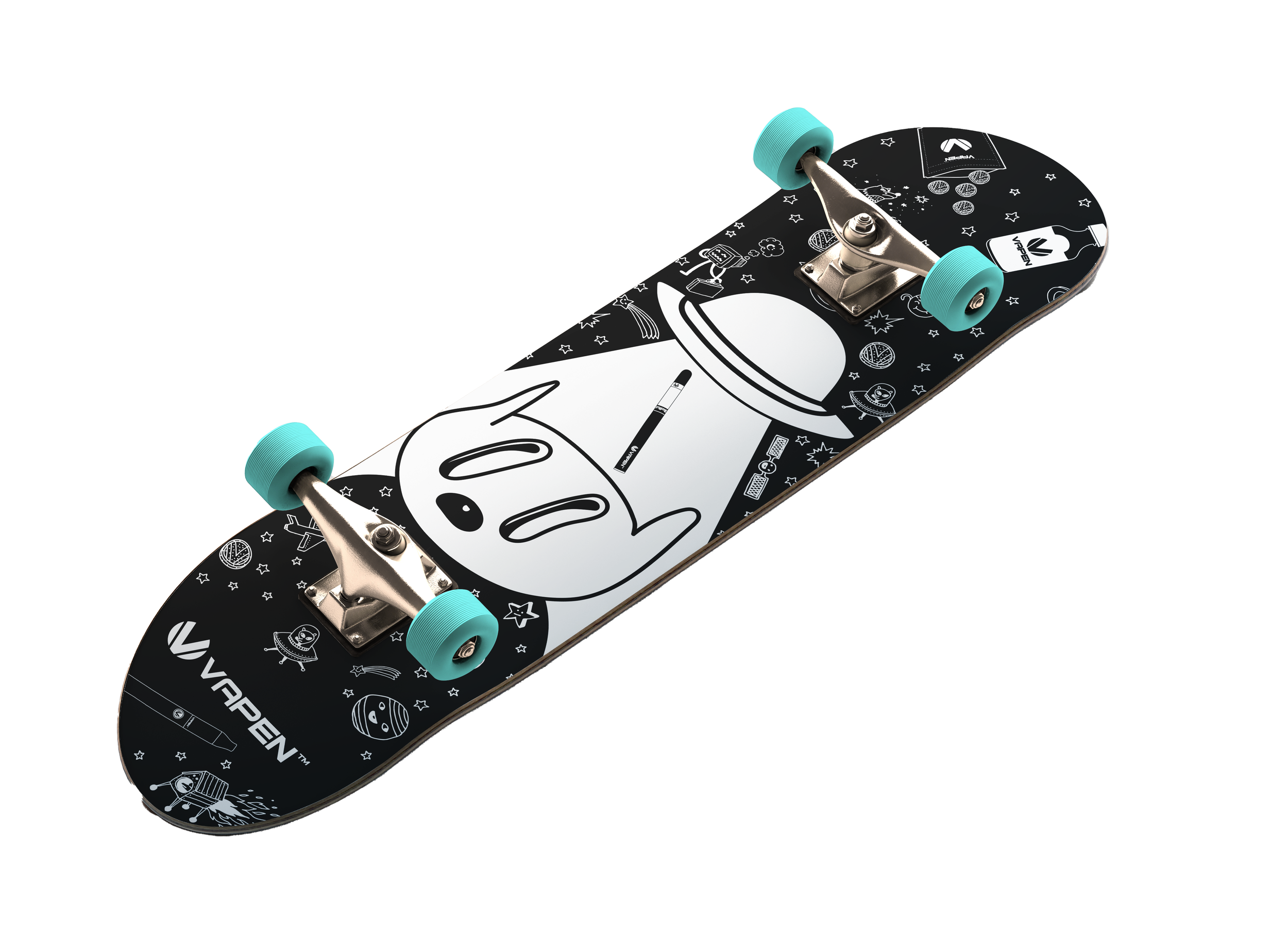
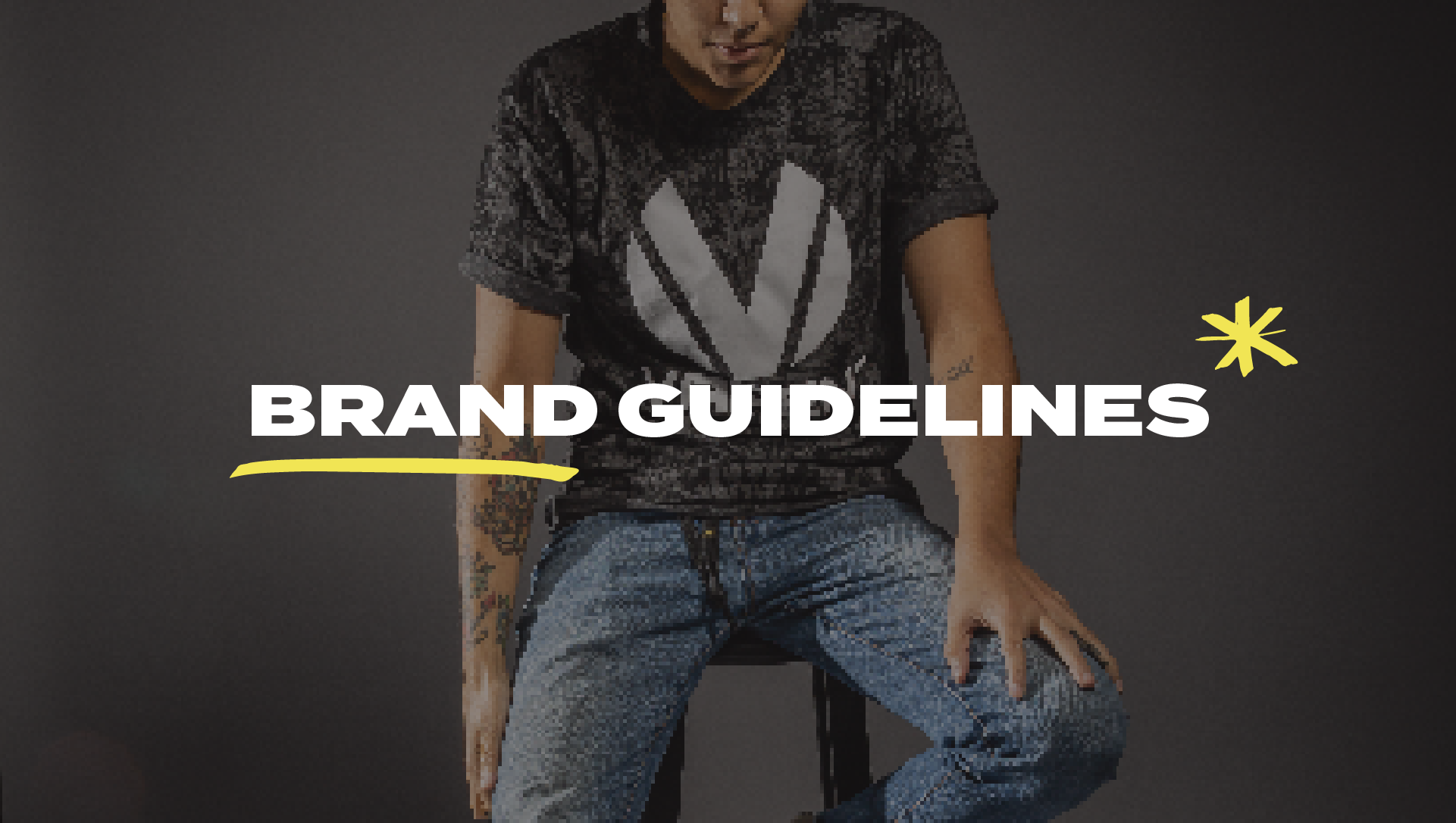
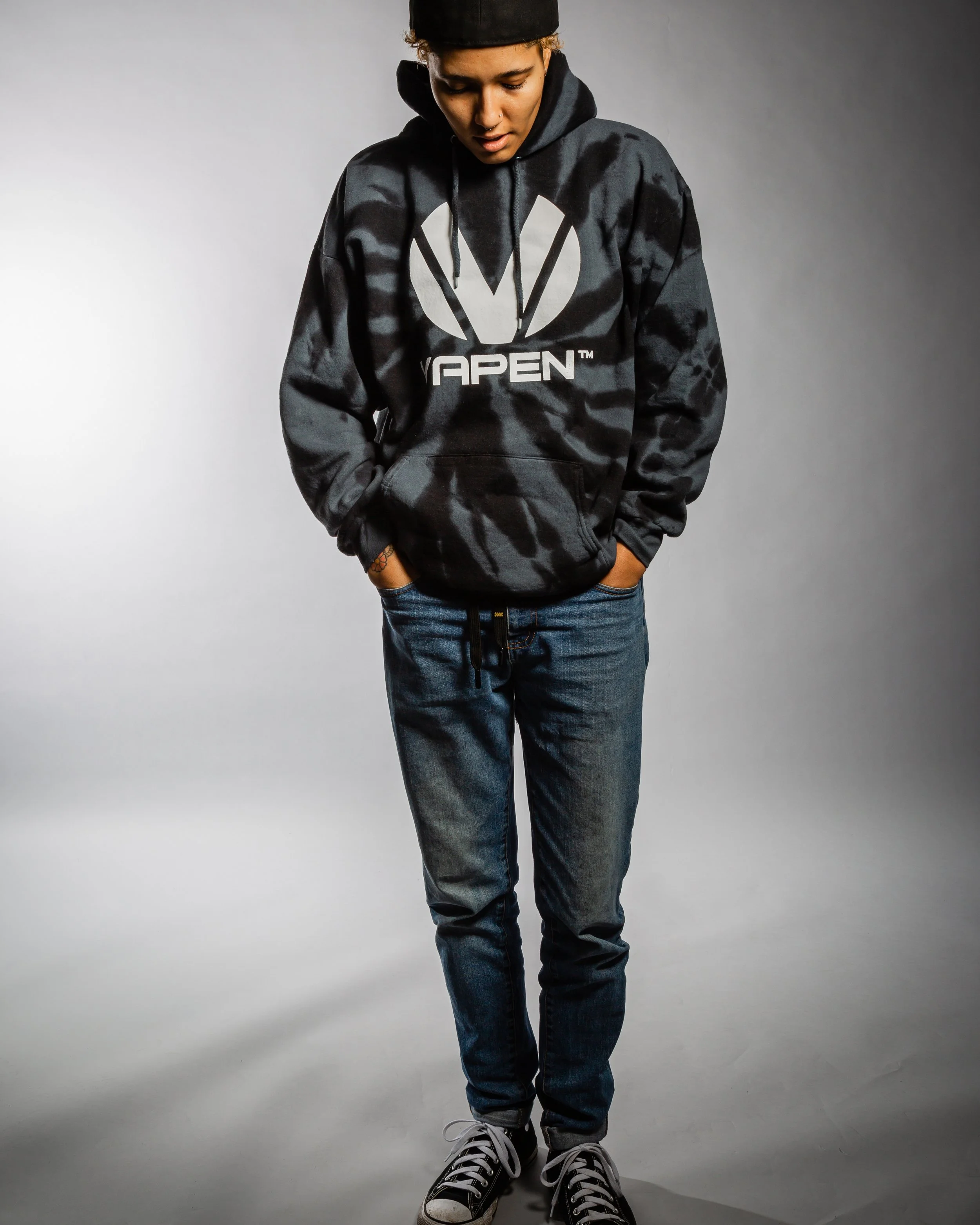
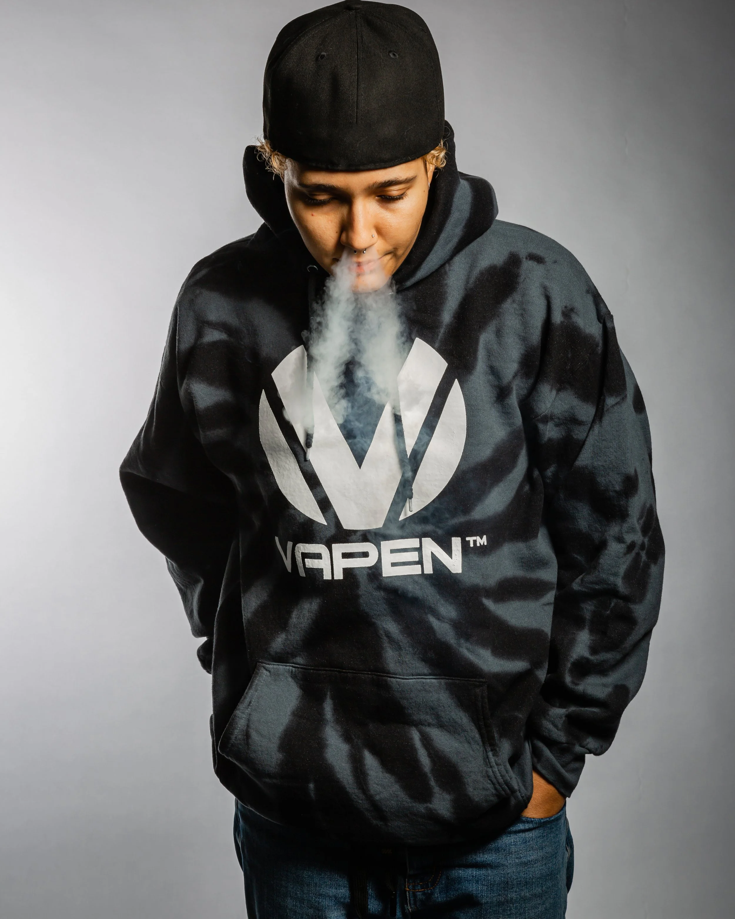
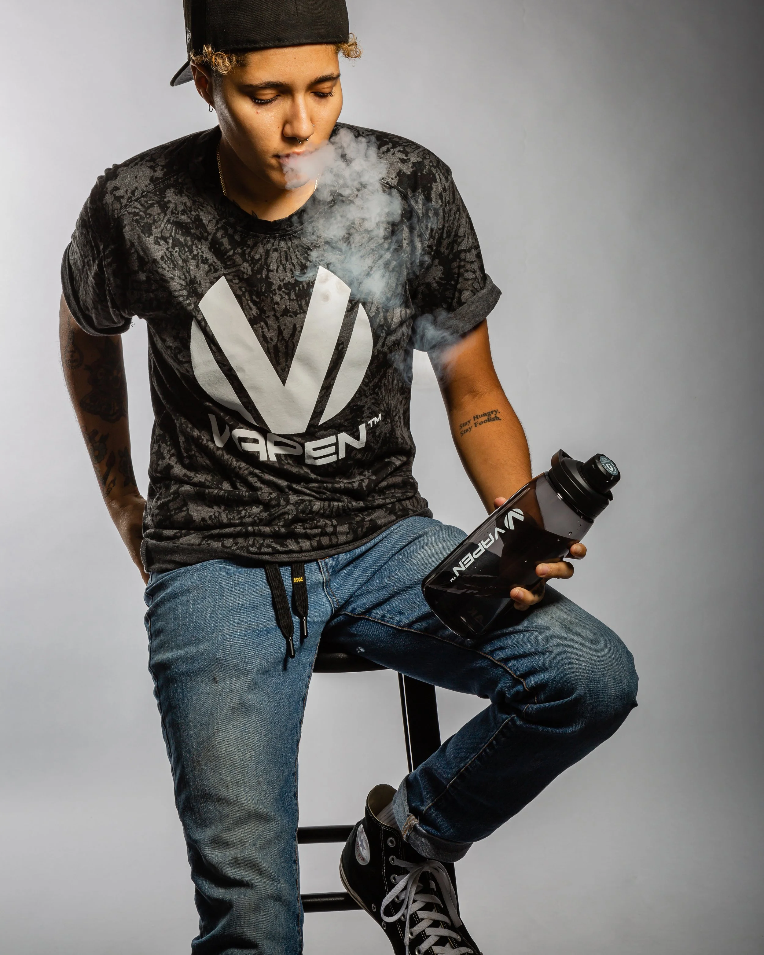
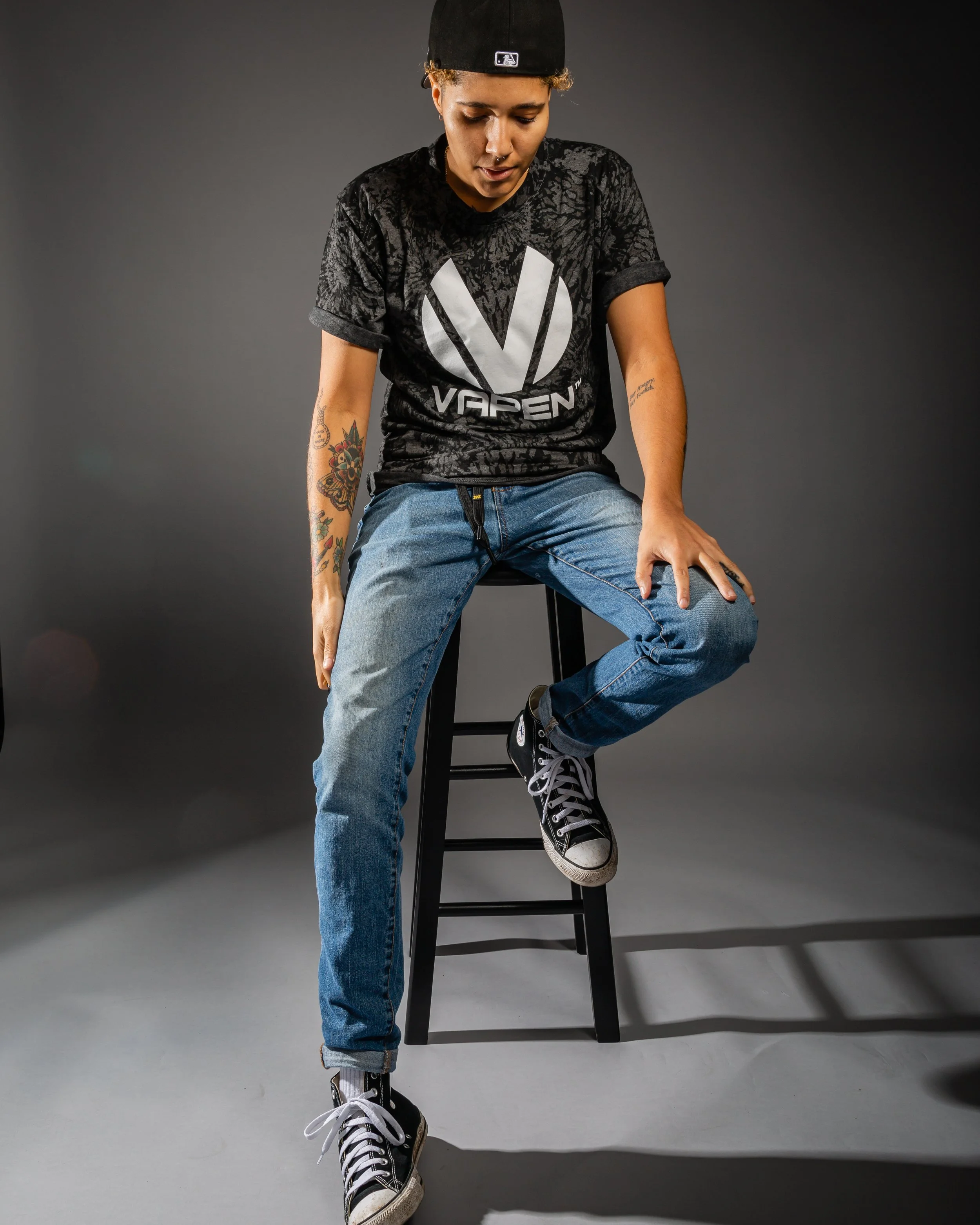
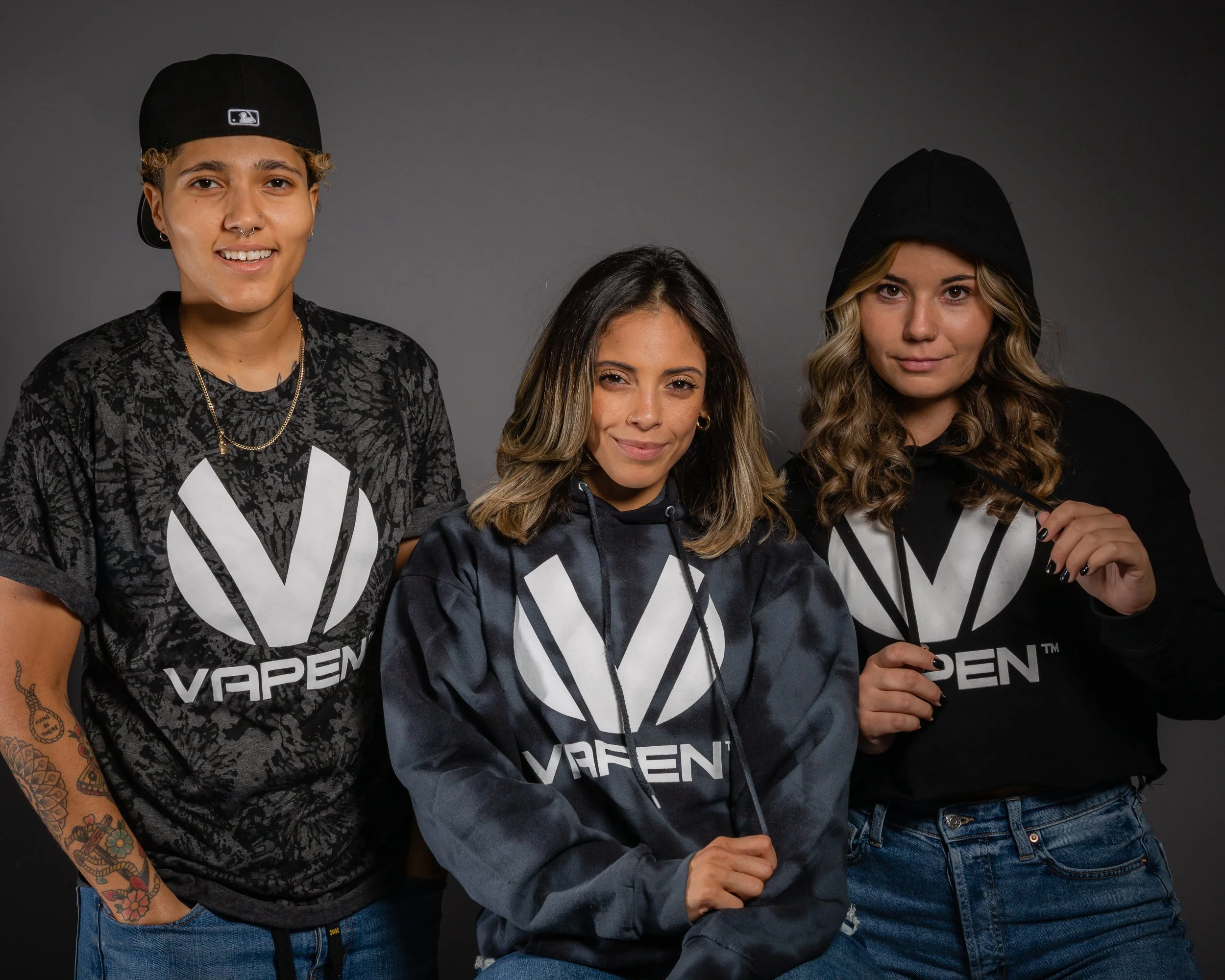
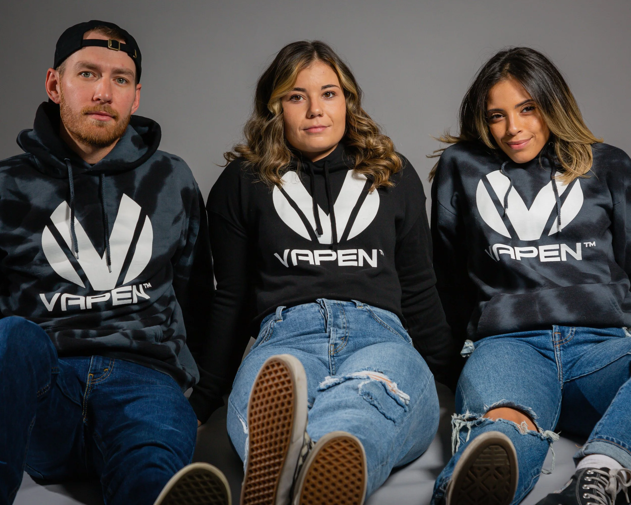
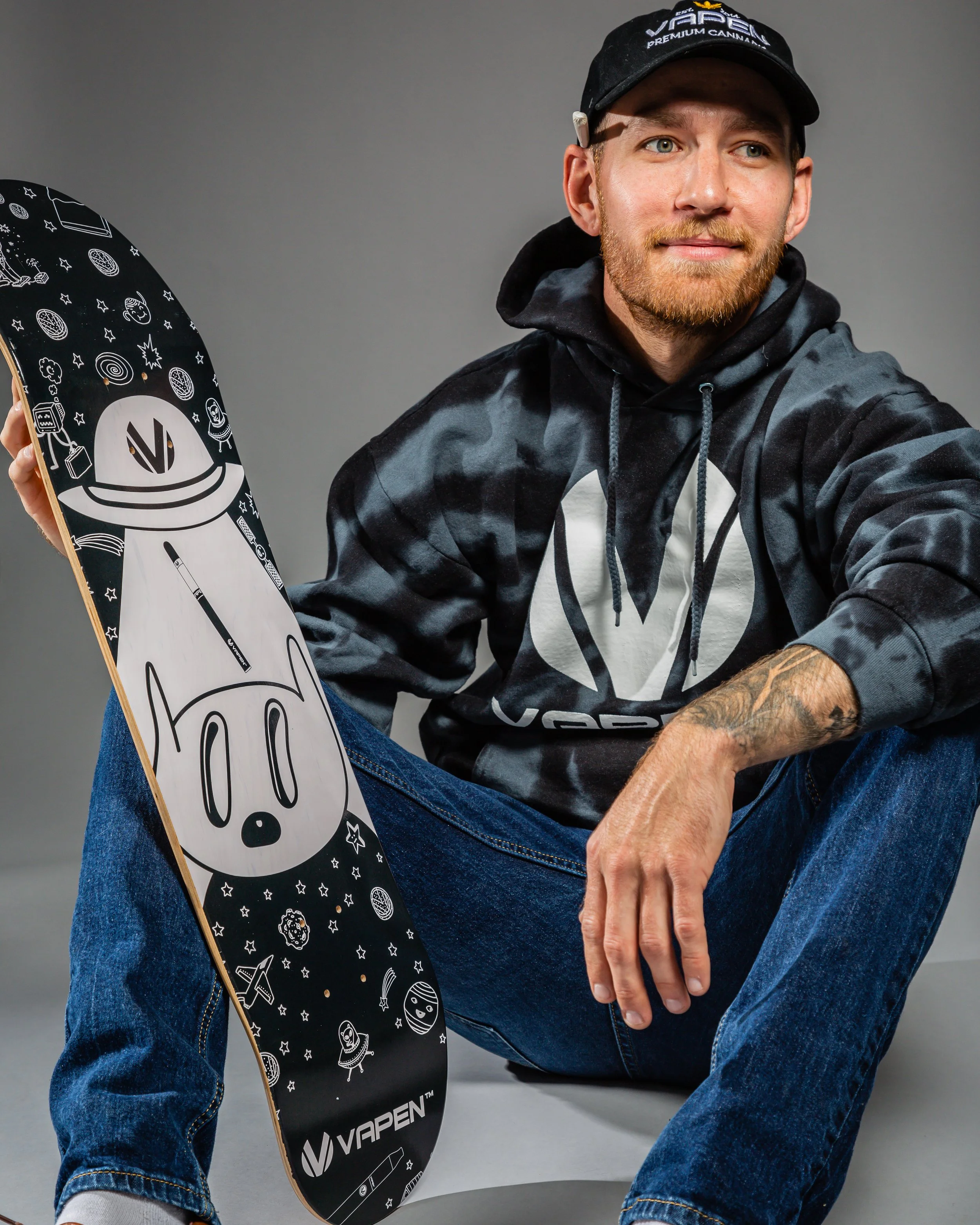
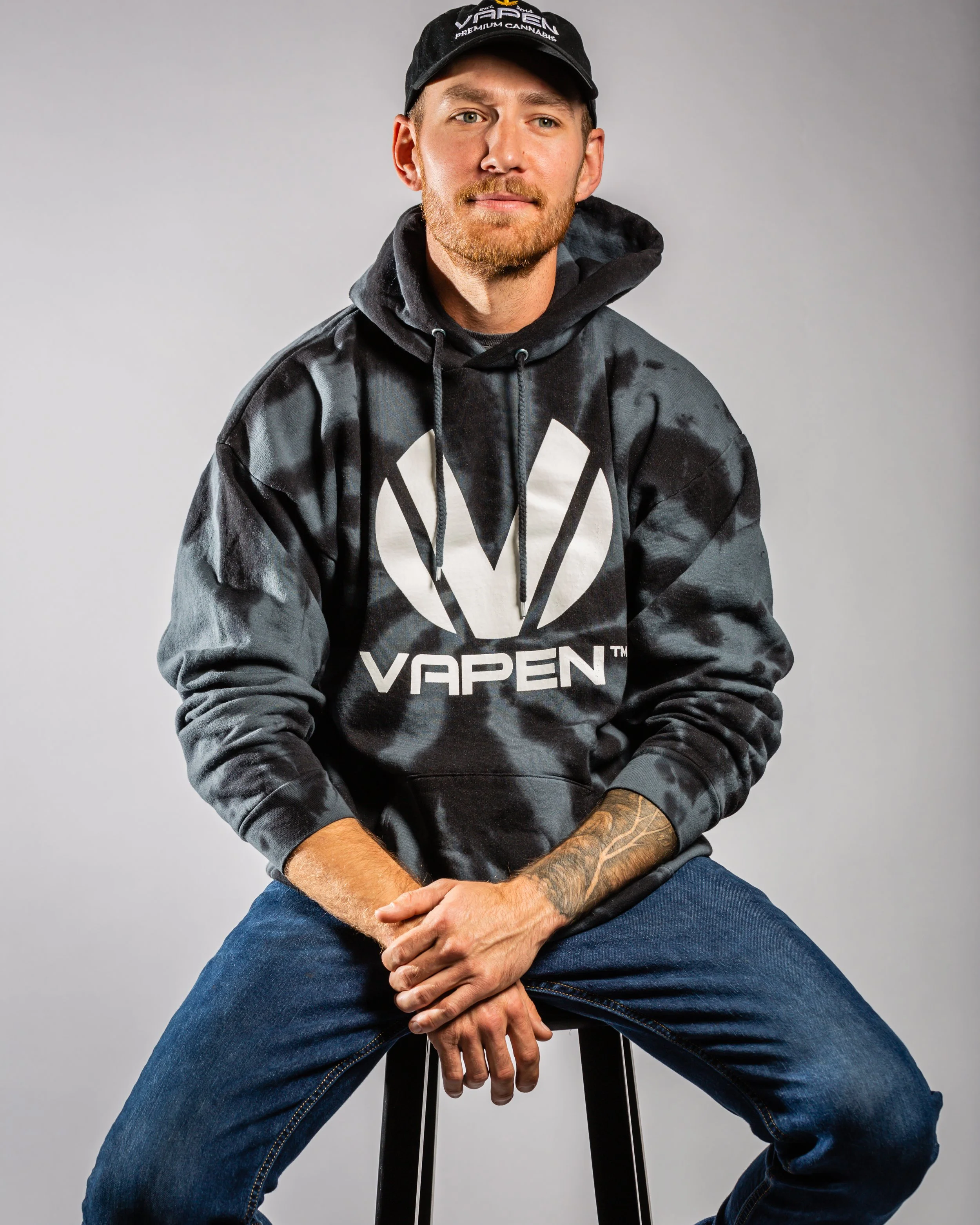
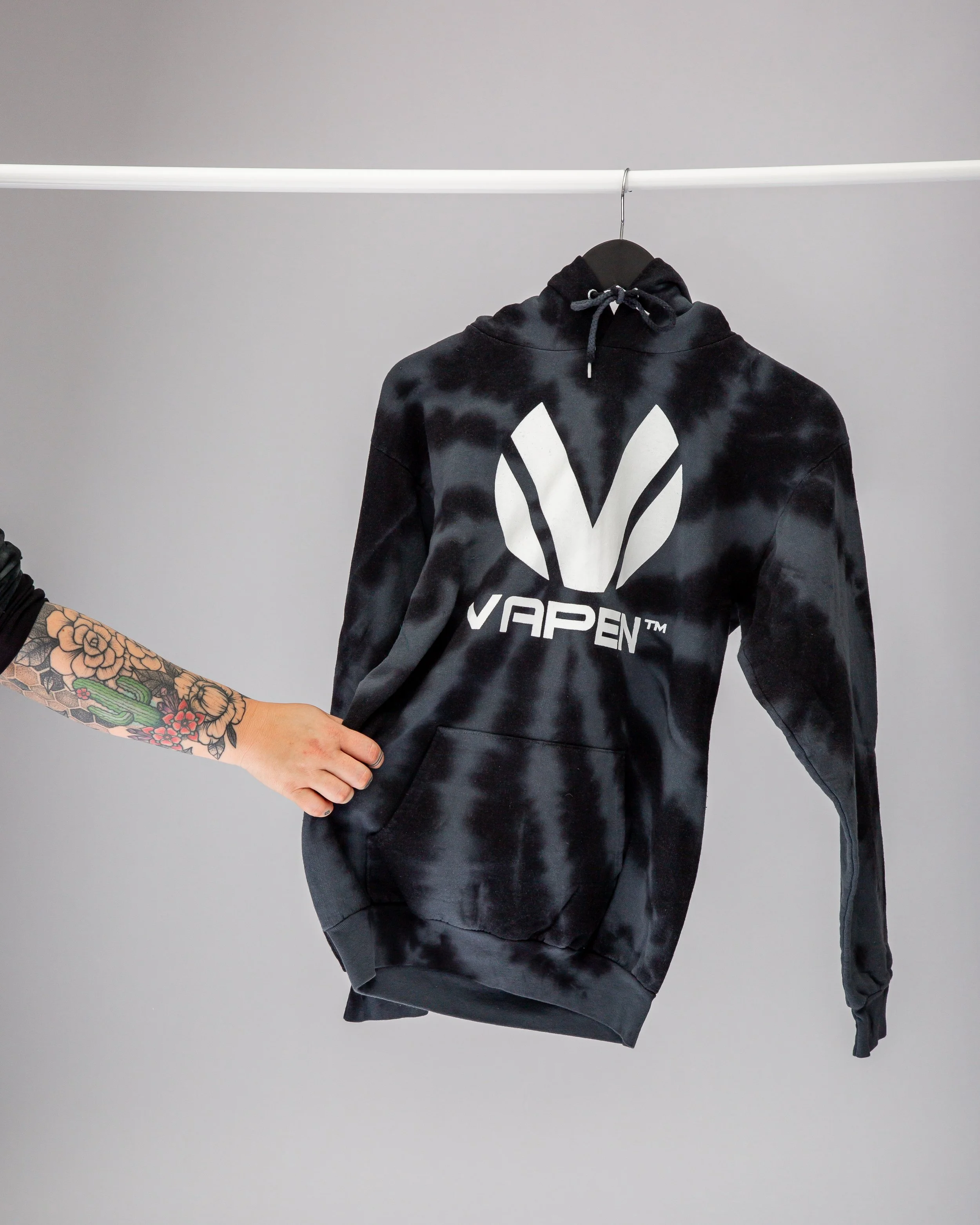
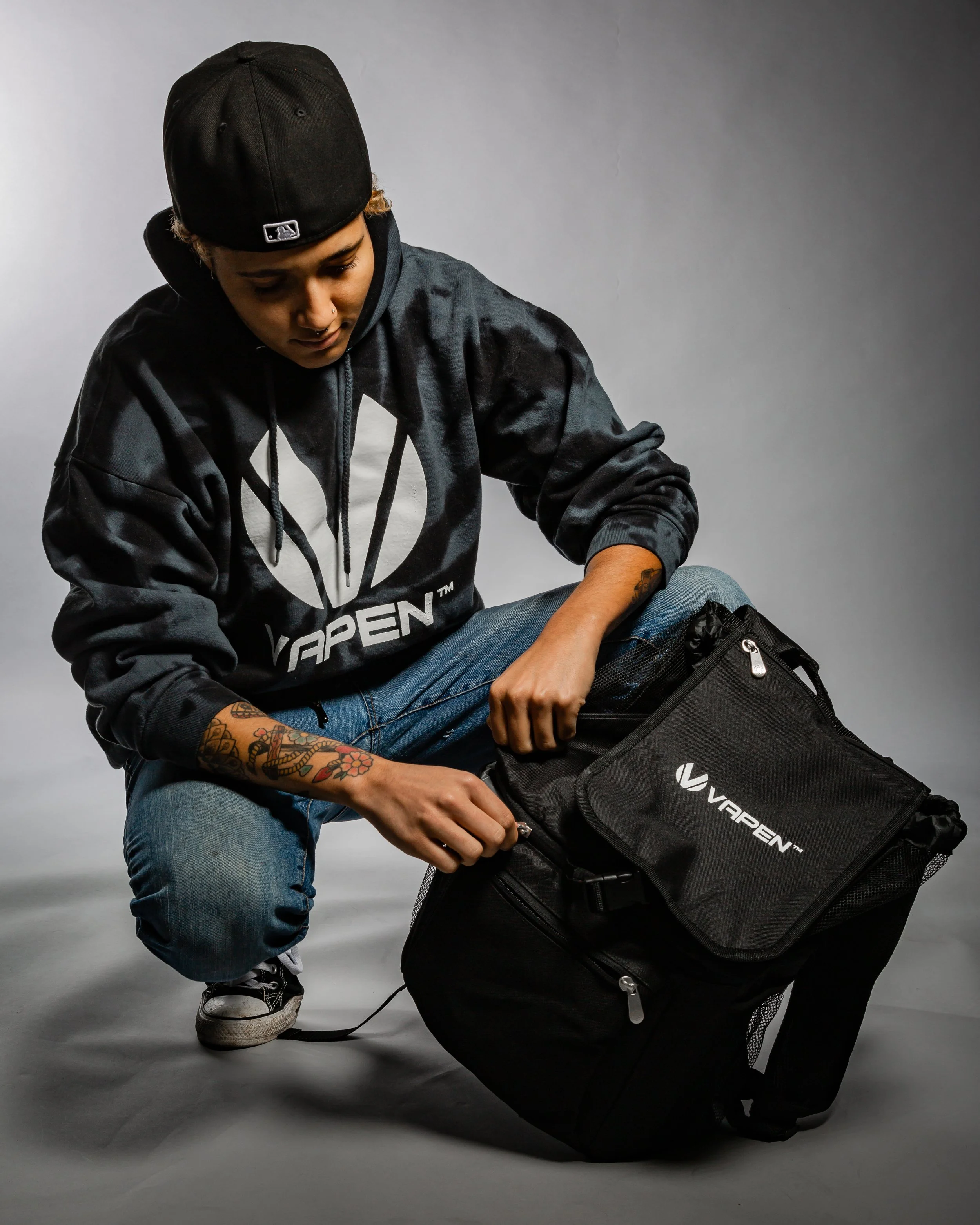
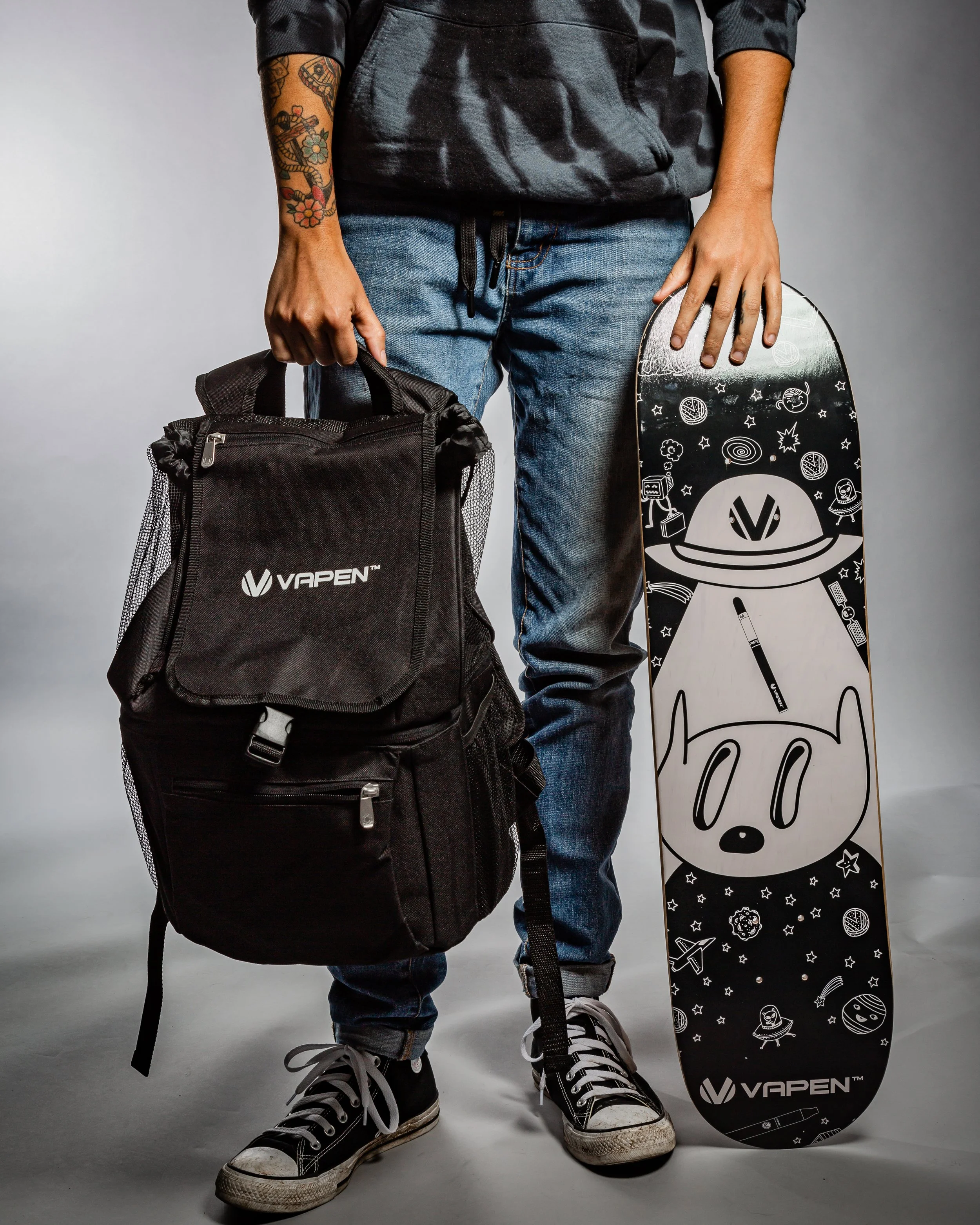
merchandise
I designed a full streetwear merch line and art directed the photoshoot. The brief was the same as the brand — clean silhouettes, bold branding, a tie-dye aesthetic that felt native to cannabis culture rather than borrowed from it. The skateboard is my personal favorite.
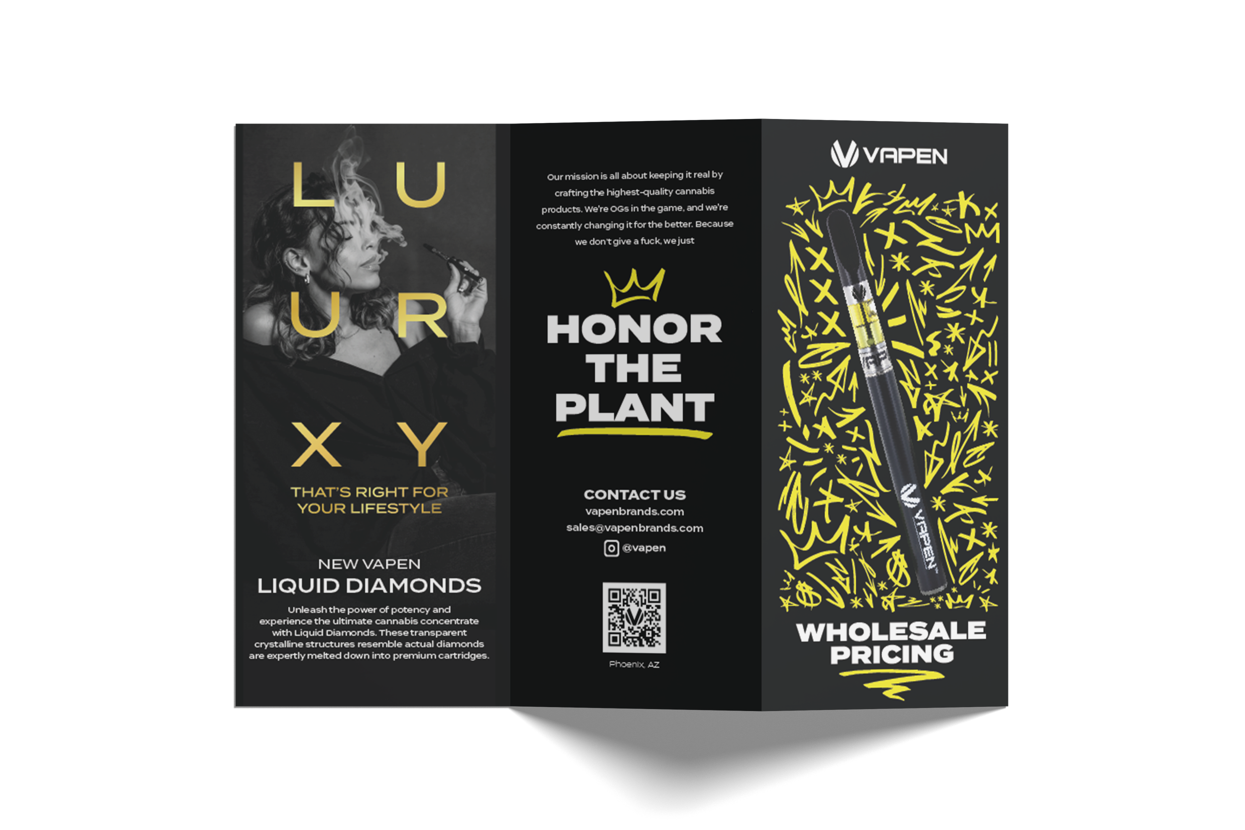
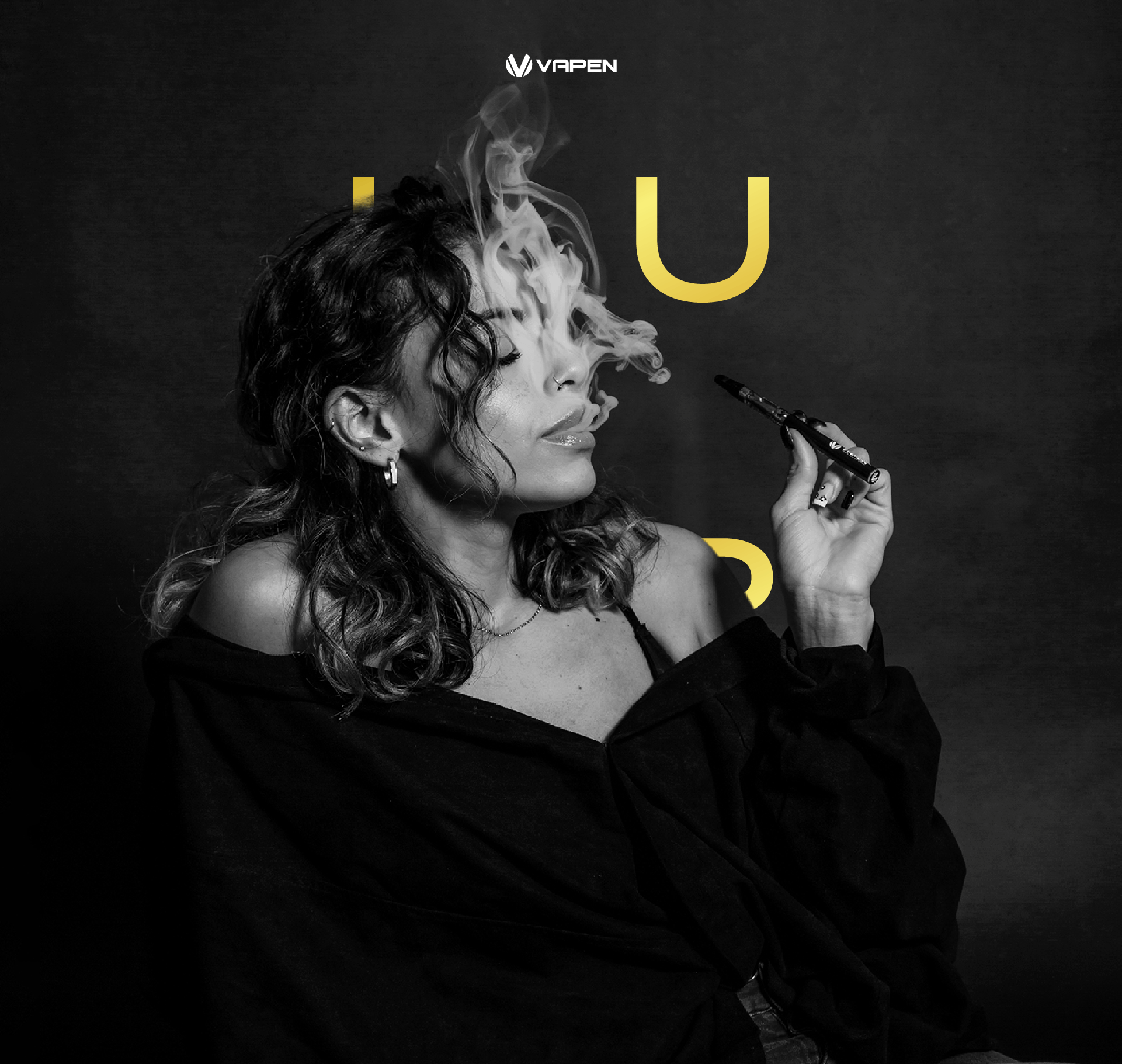
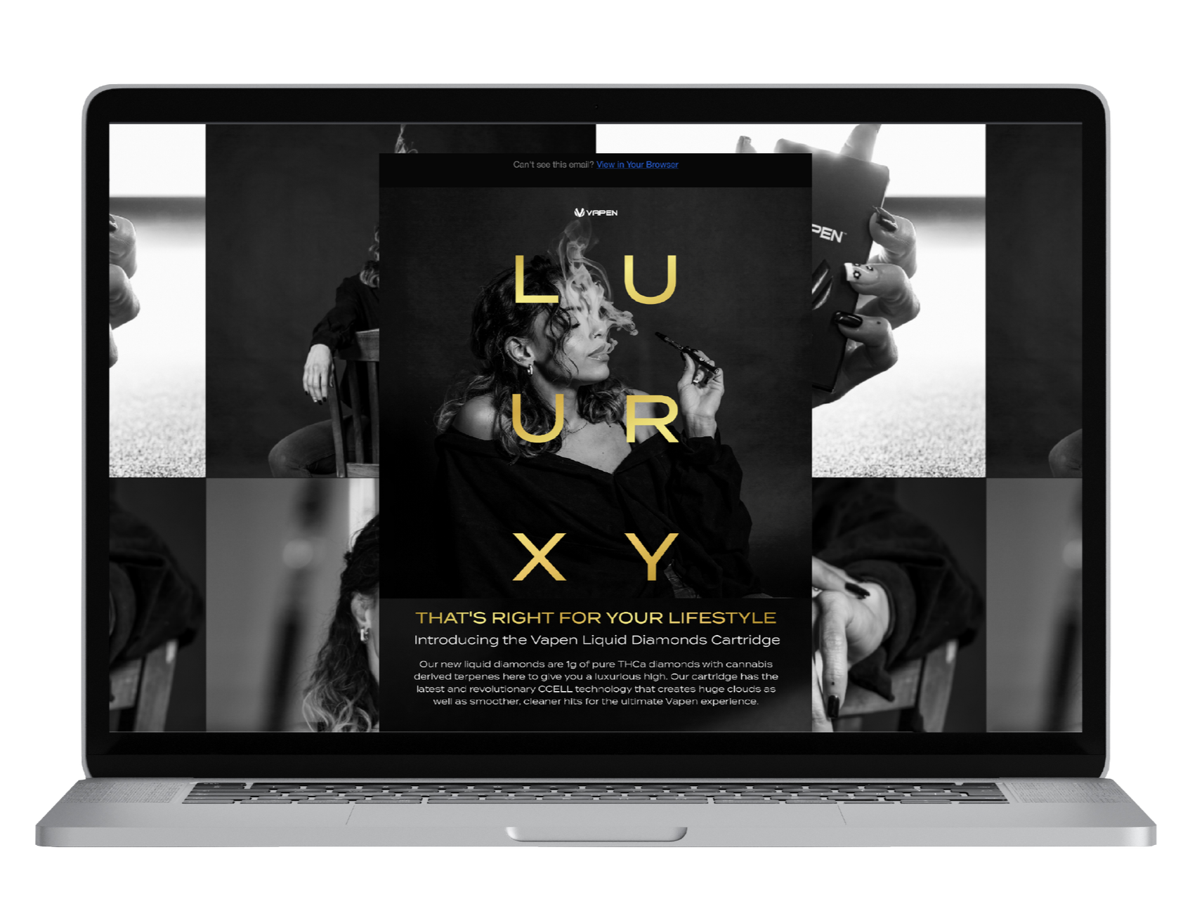
liquid diamonds
A higher price point product needed a higher register. Liquid Diamonds was a new high-potency concentrate — premium, luxury, a different audience than Vapen's core. I developed the full launch: ambiguous teaser posters to create intrigue before the reveal, in-store POS materials across multiple dispensary locations, and a consumer-facing email campaign. Demand outpaced supply. Dispensaries were requesting more materials than we had printed.


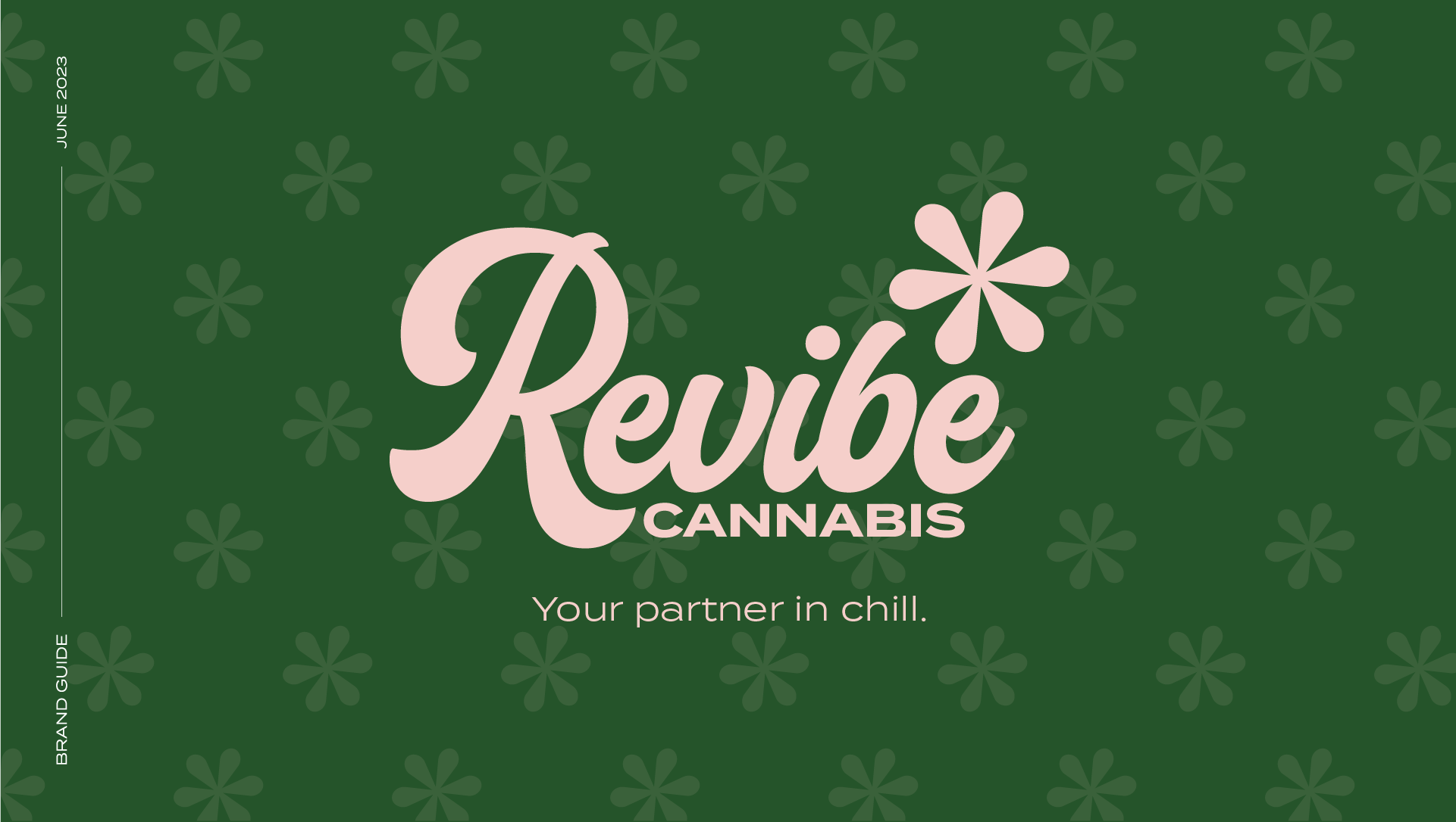
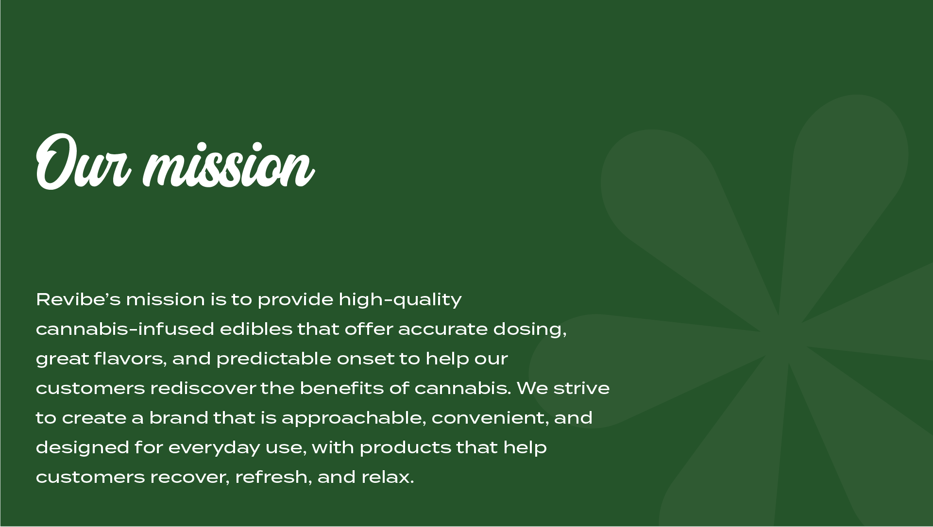
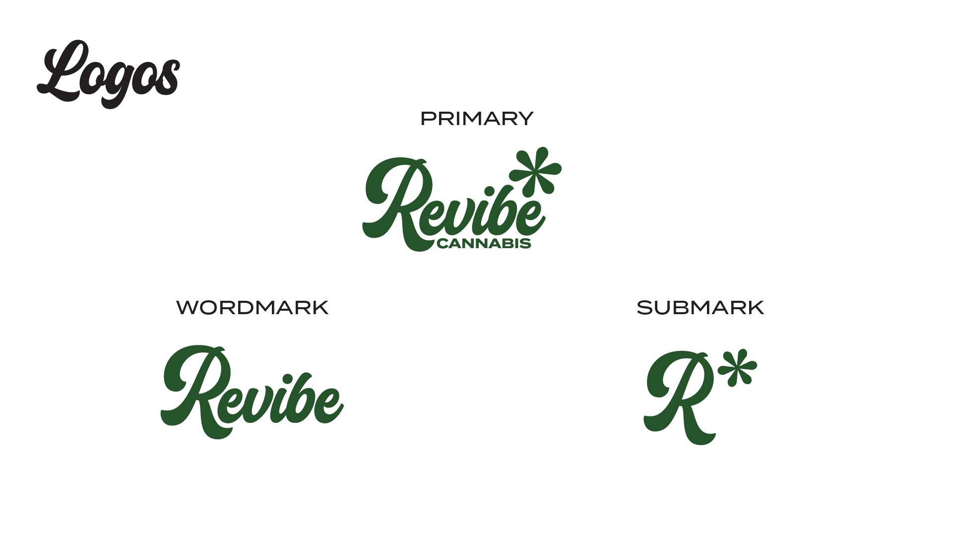
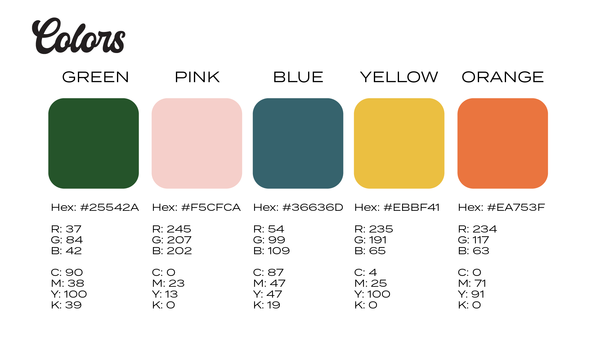
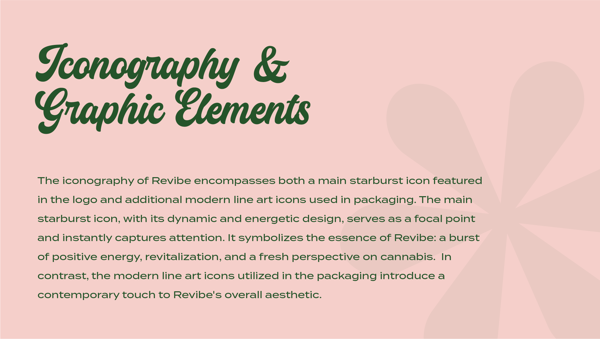
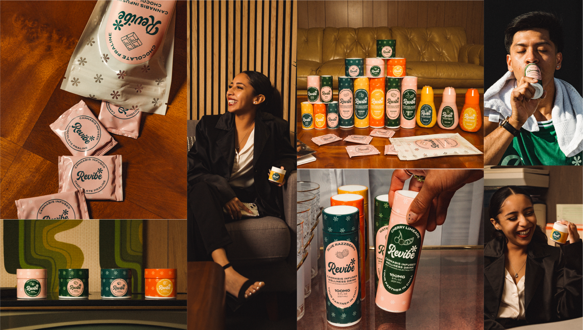
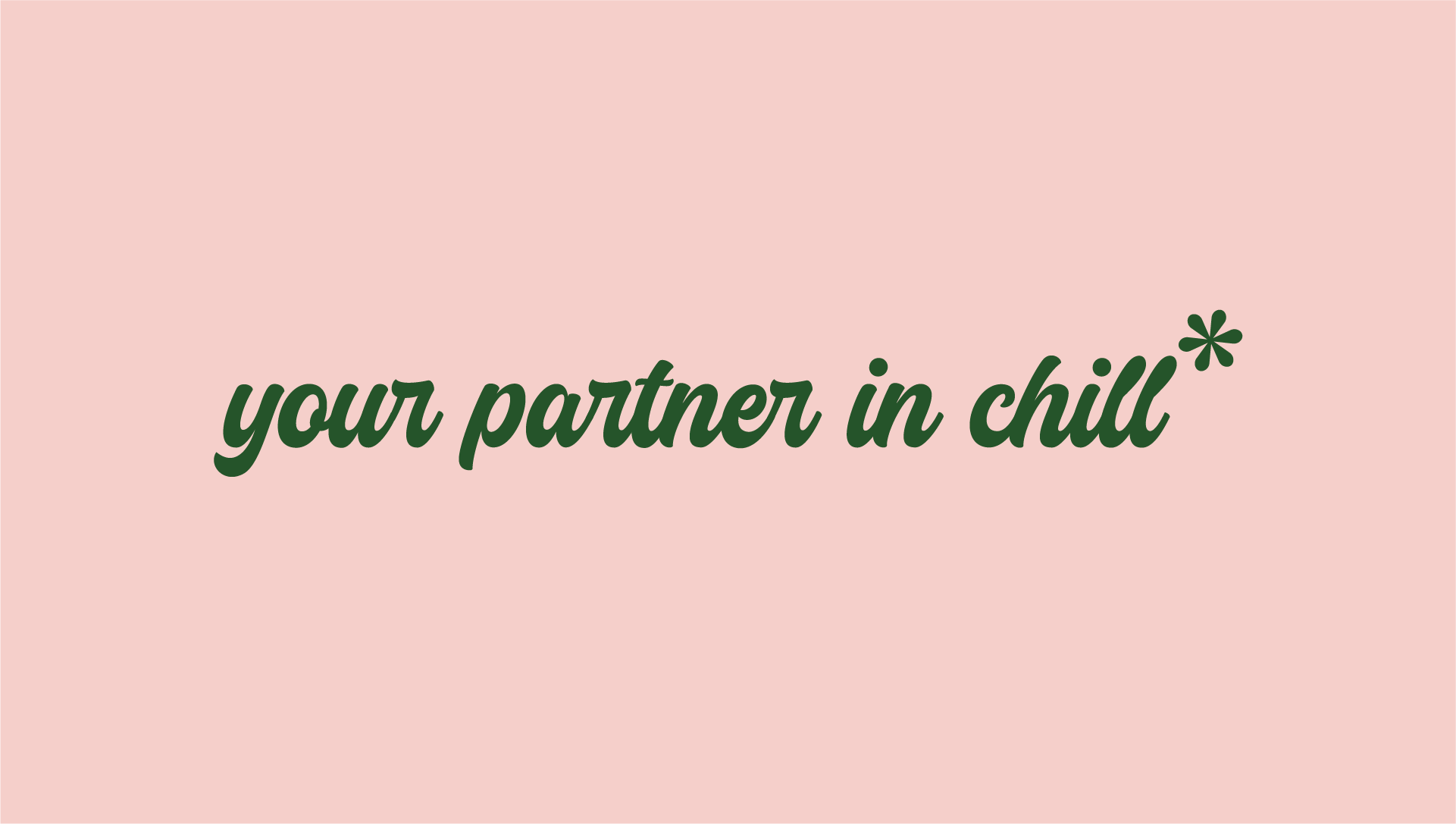
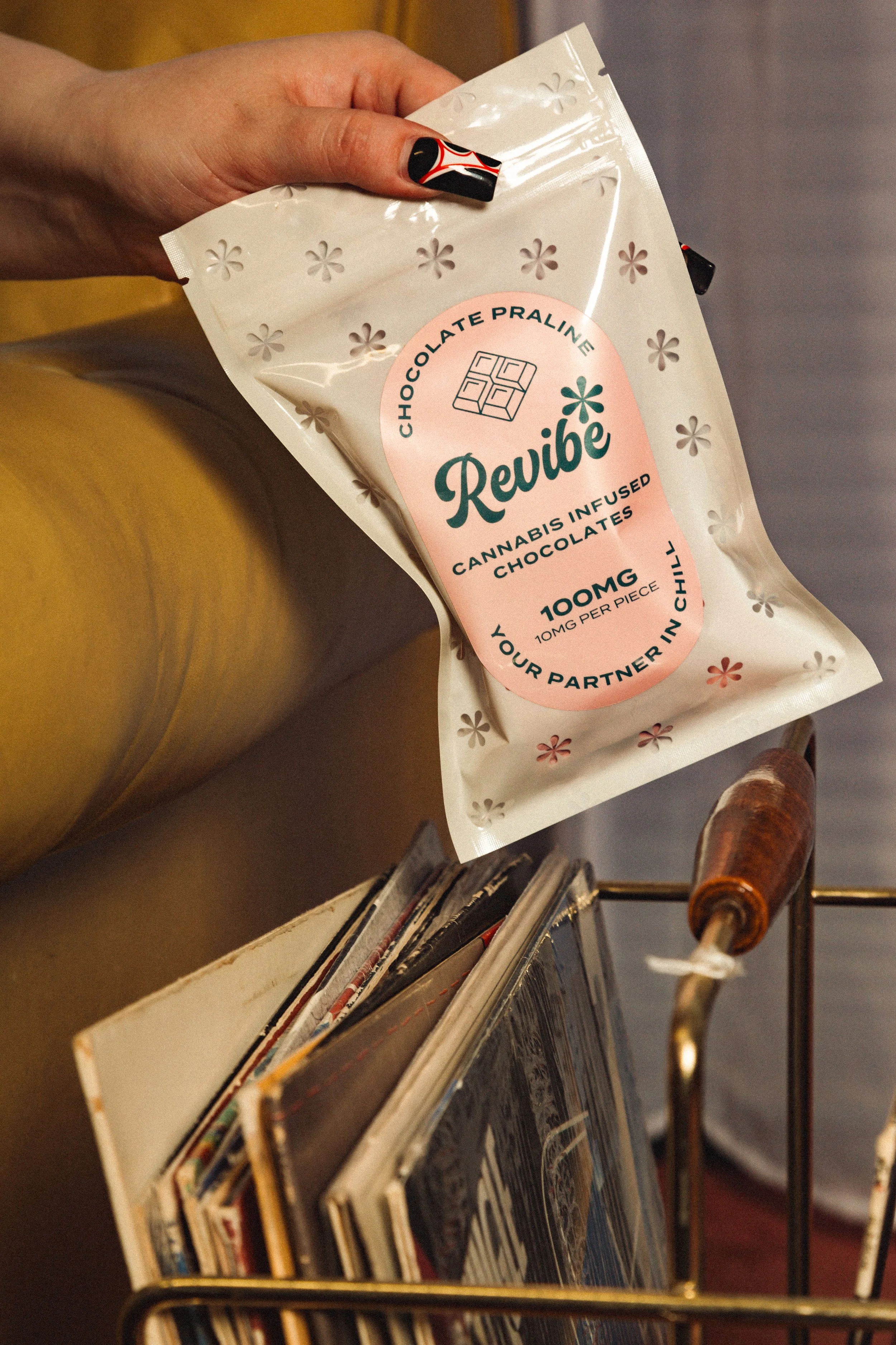
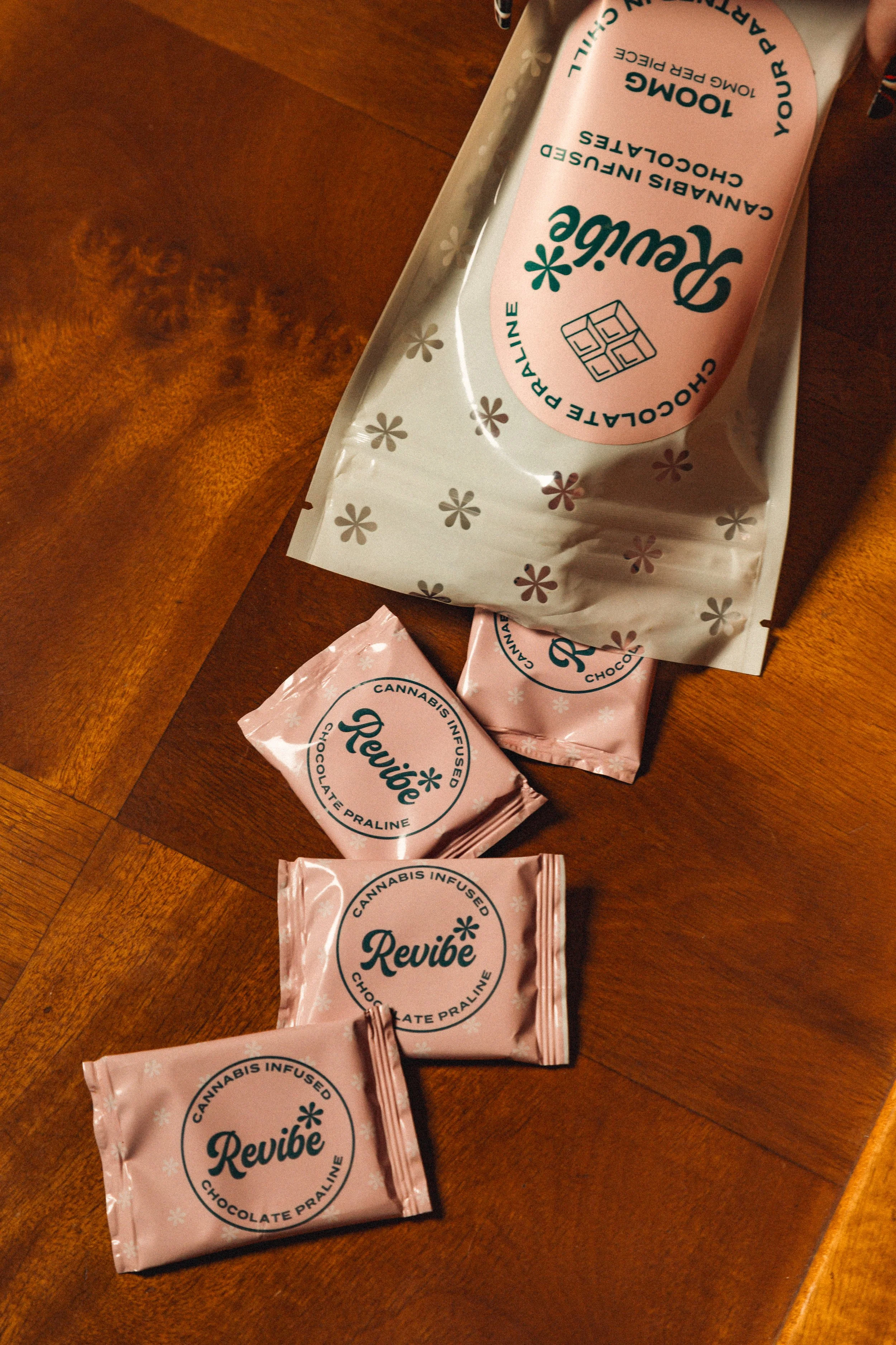
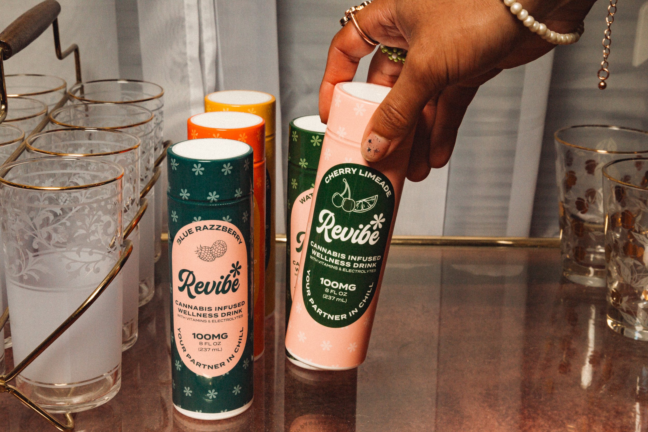
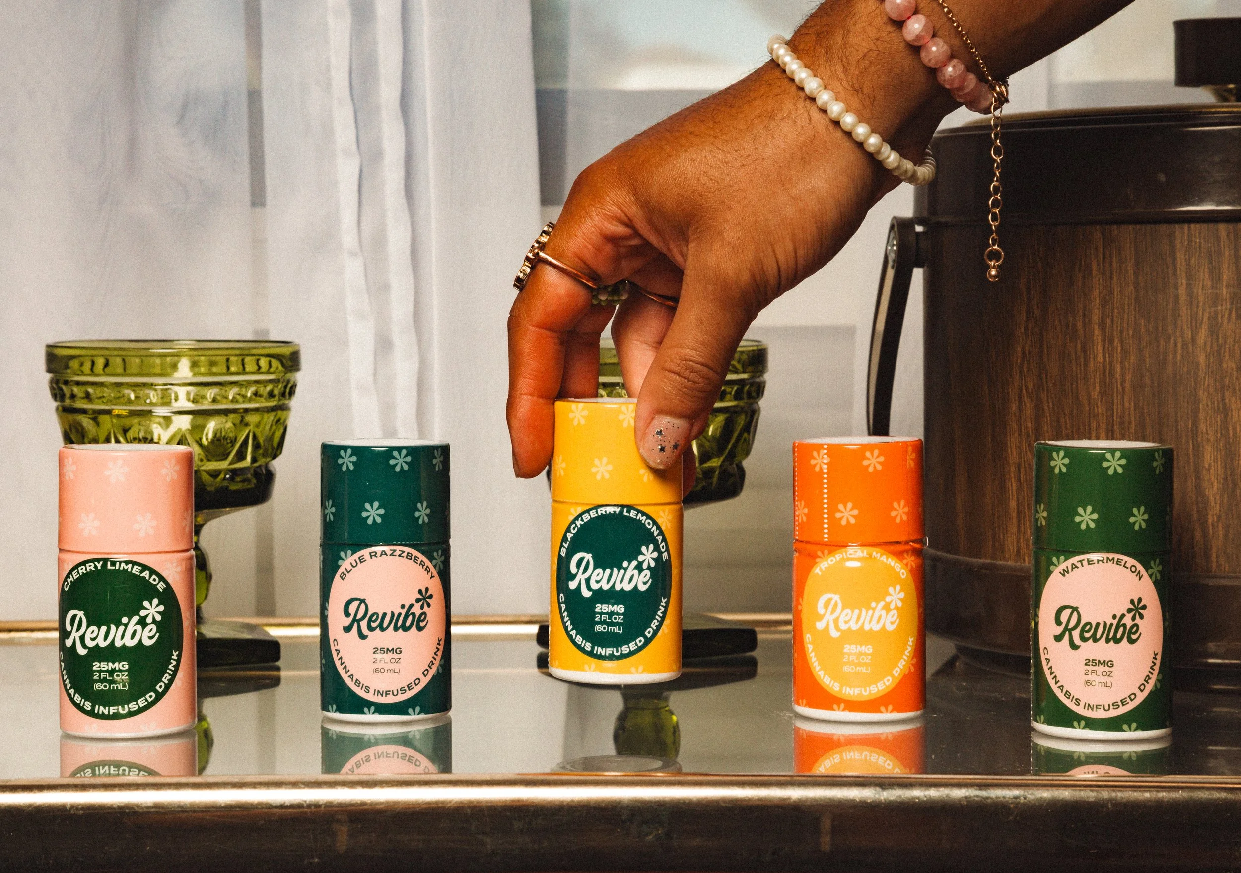
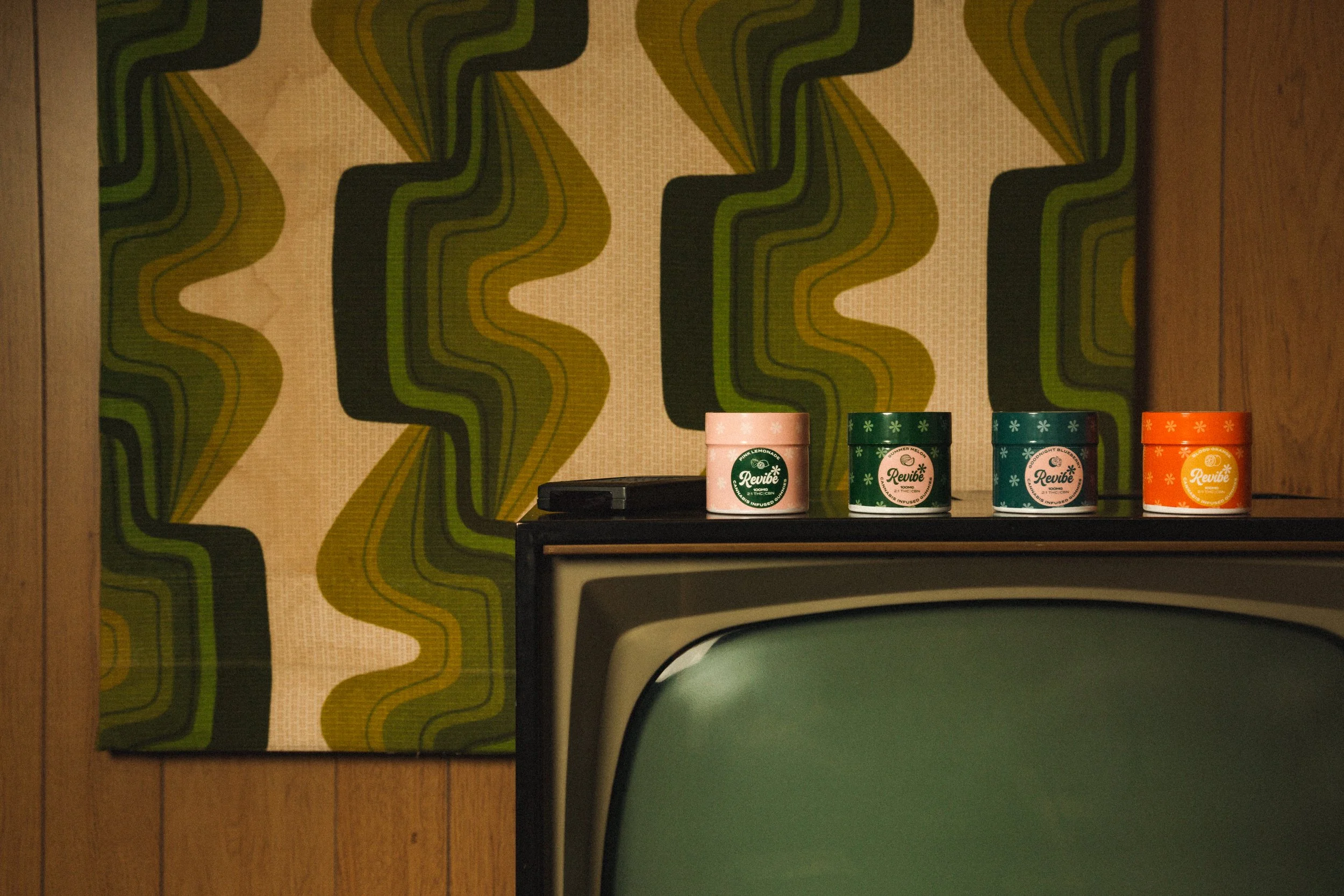
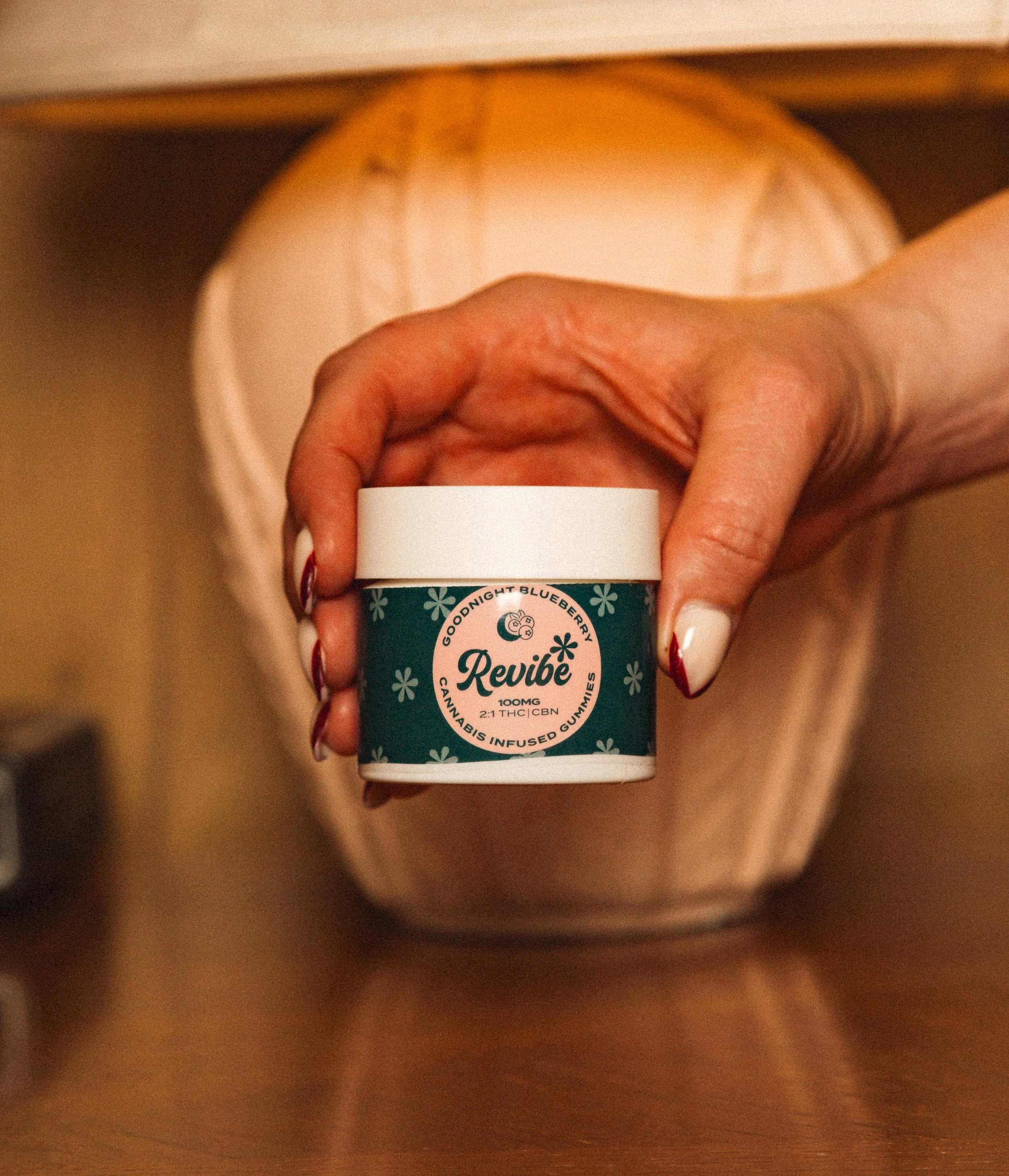
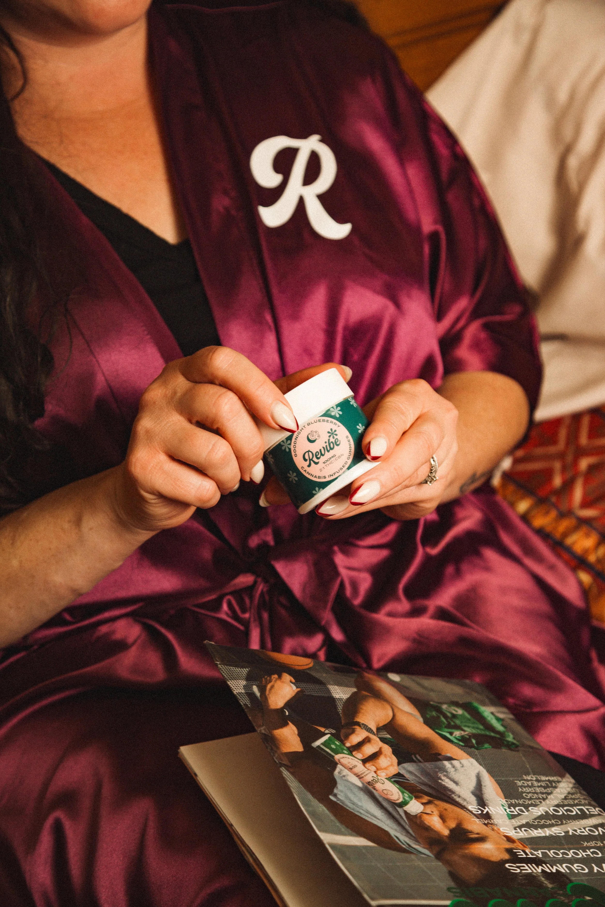
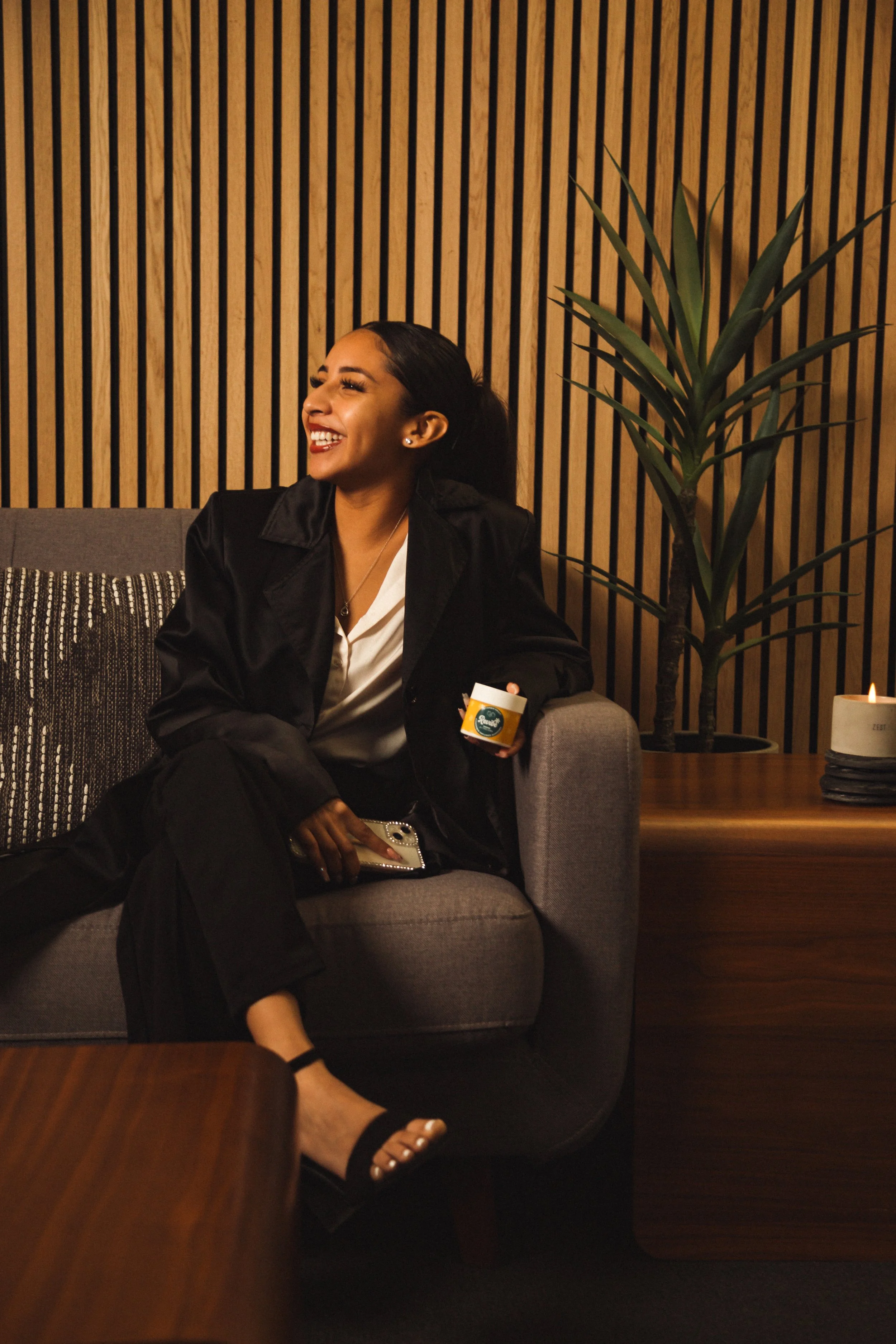
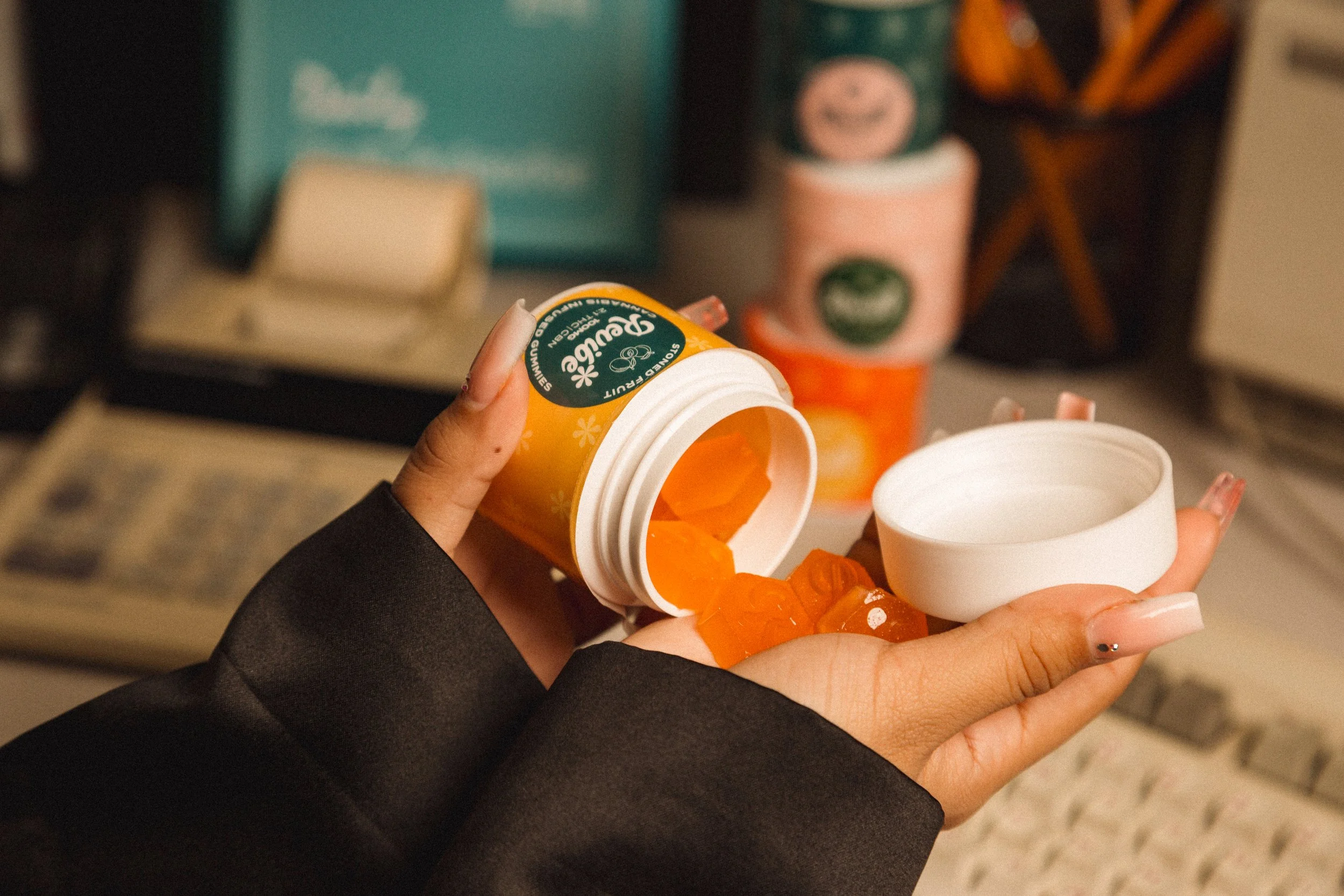
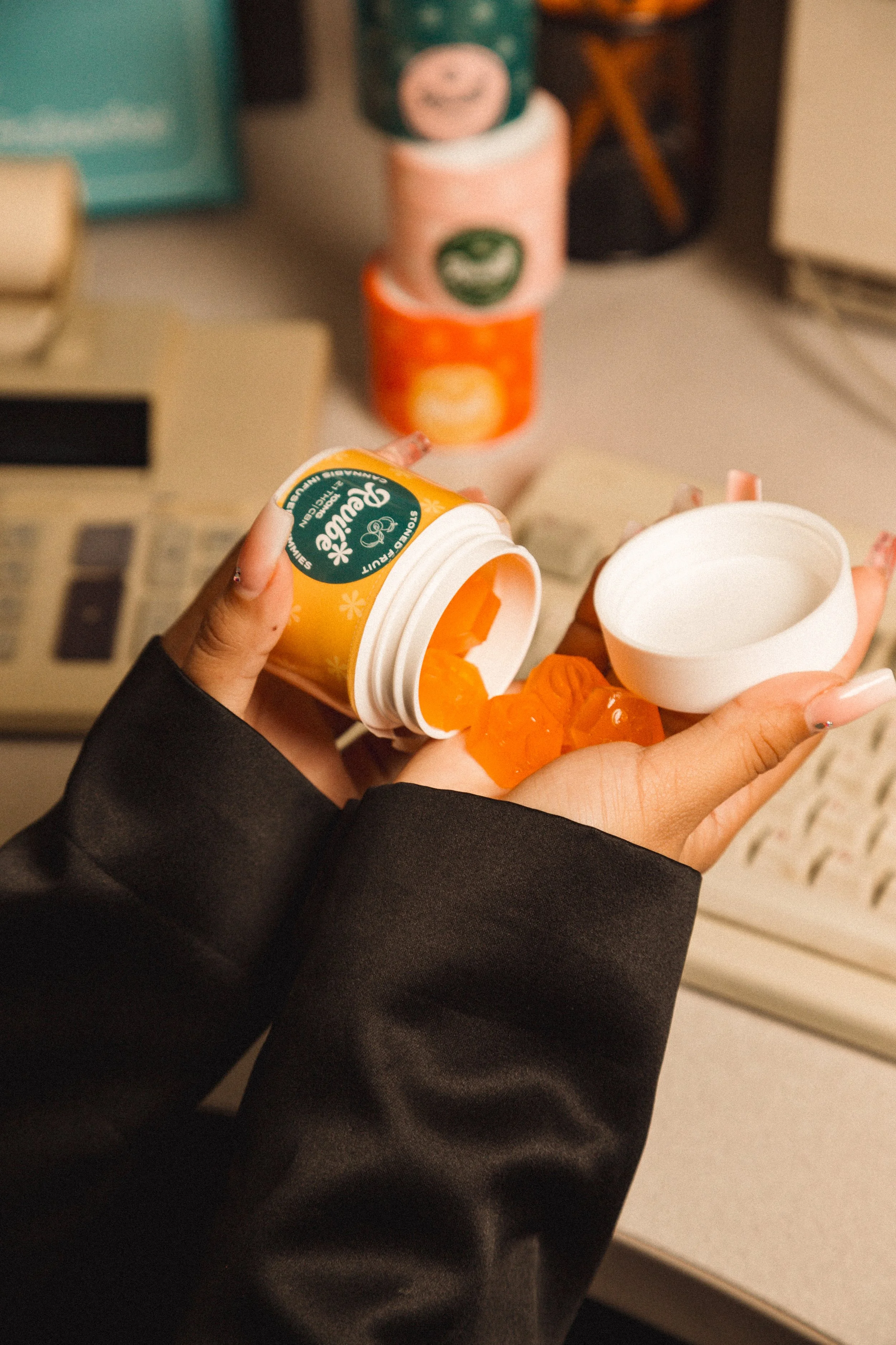
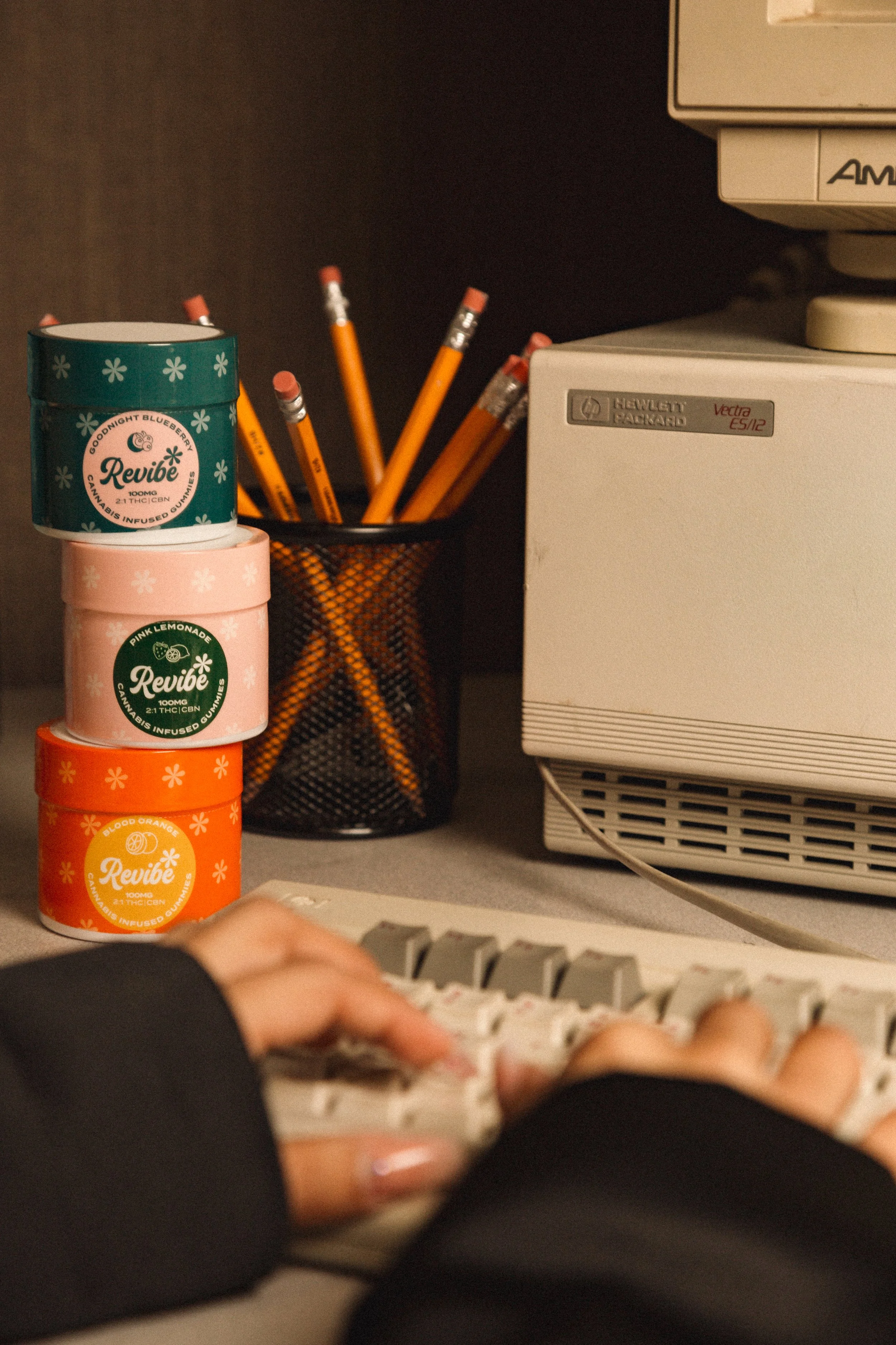
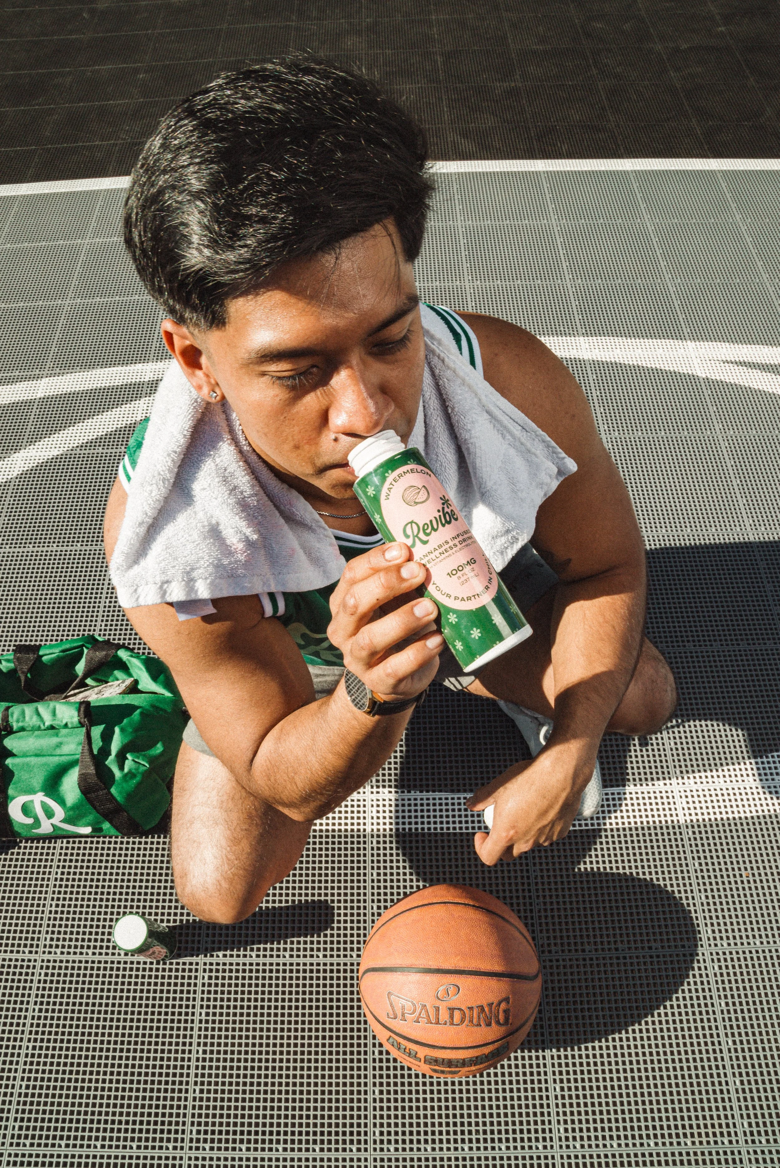
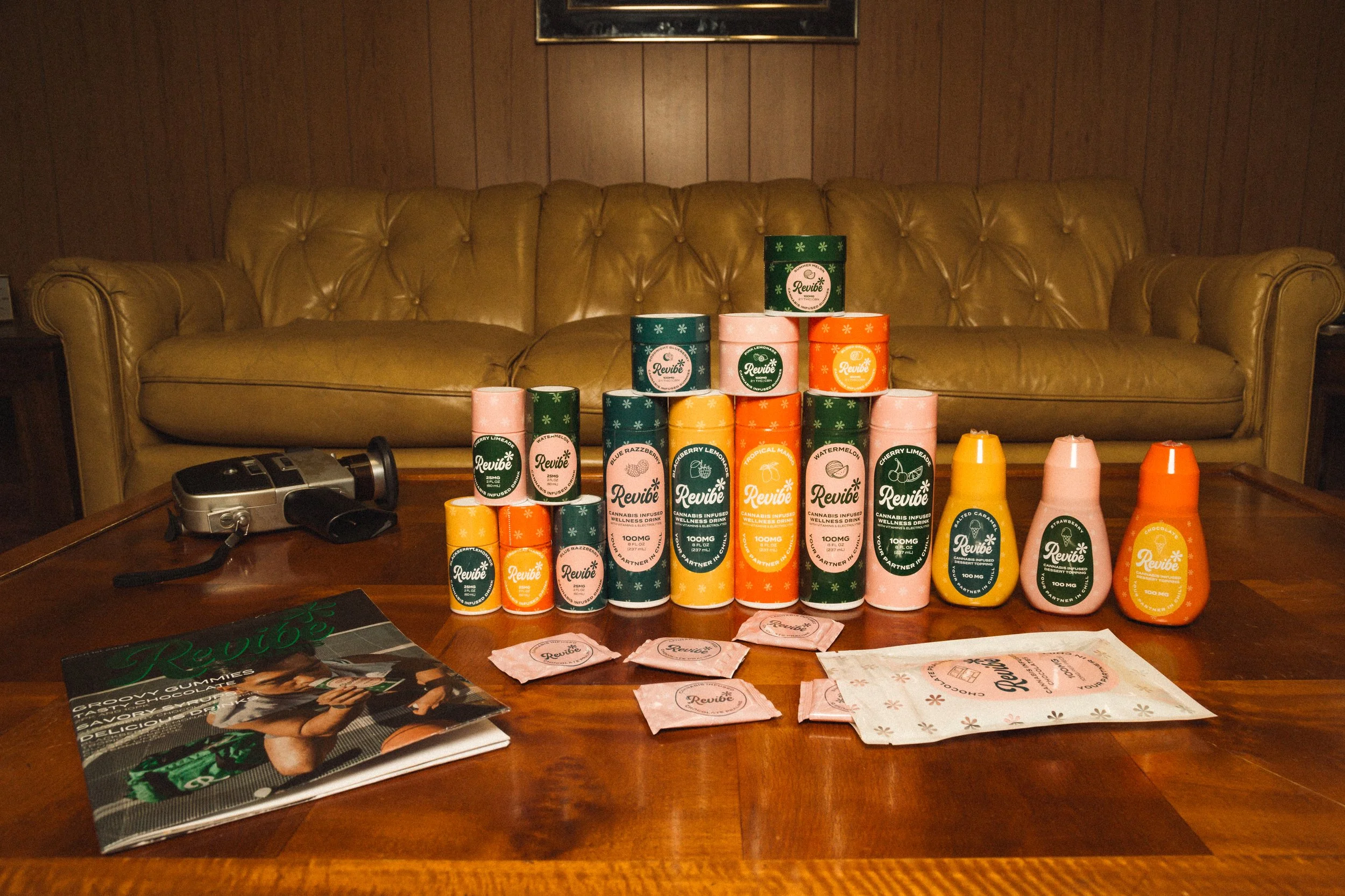
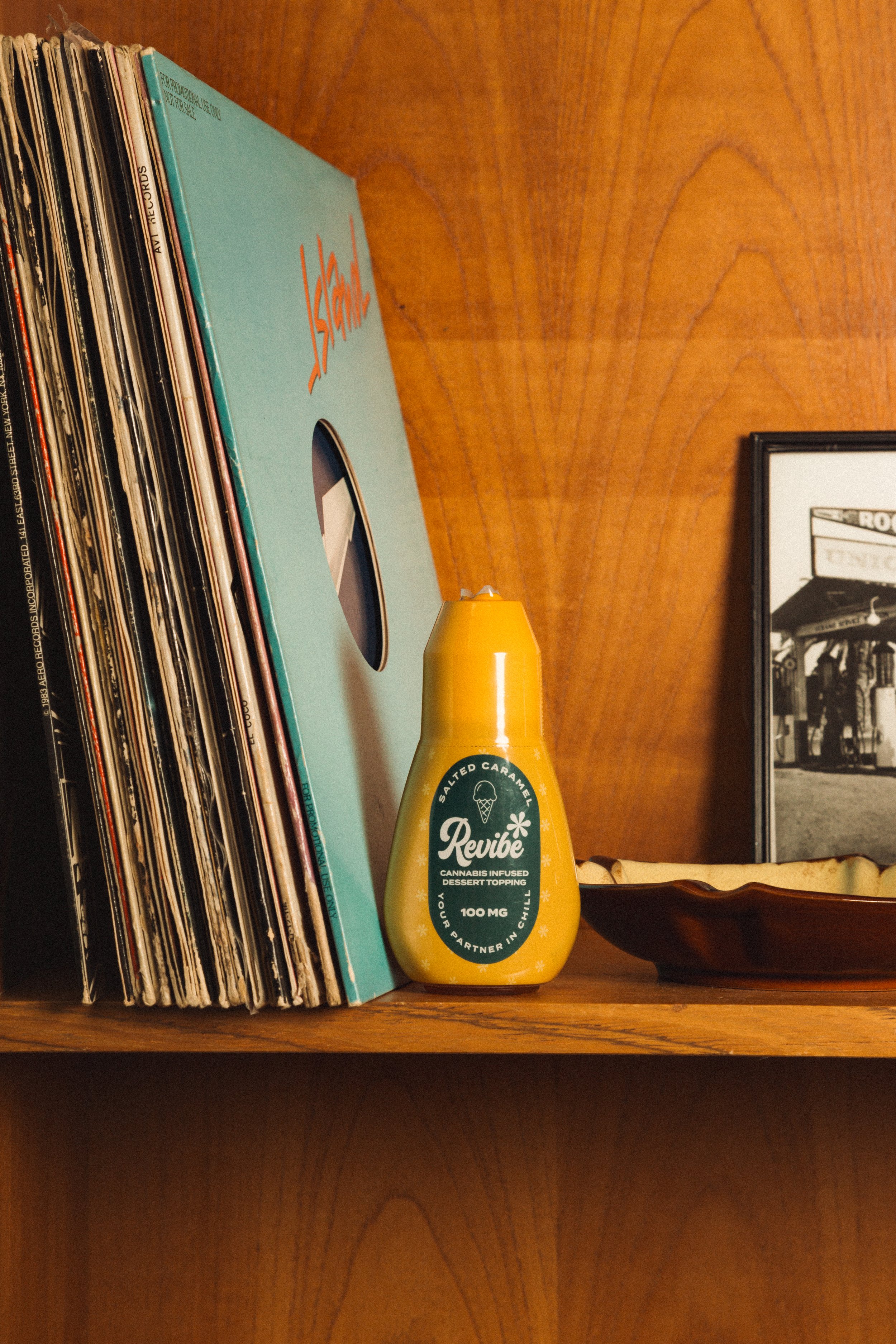
Revibe
I built and launched Revibe as a standalone sub-brand within the Vapen organization. The idea was to make cannabis approachable and simple again — a different product for a different audience. Where Vapen was rebellious and urban, Revibe was warm, nostalgic, and inviting. Completely separate visual language, packaging system, and art direction. Two brands. Same umbrella. No visual confusion.


building the team from zero
There was no creative department before I was hired. I built it with intention — each role defined by what it needed to accomplish, not just what existed at other companies.
-
2x junior designers
Day-to-day execution and production, freeing me to focus on higher-level creative direction
-
Photographer
Lifestyle and campaign — real people, real culture, never overly polished
-
Videographer
Authentic aesthetic over corporate production — rooted in the same visual language as the brand
Building a strong team isn't just about hiring talent — it's about creating the structure and clarity that lets that talent perform. Once the team knew the brand, they could run with their creativity and it still felt like Vapen.
-
47%
Revenue growth in the first year after launching the brand identity and visual system
-
40%
Growth in social engagement from a full visual and content refresh