BRAND STRATEGY • VISUAL SYSTEMS
Revive
Revive had no visual language and multiple disconnected brands. I built the system that unified them — deployed across marketing, sales, and customer success.
The starting point
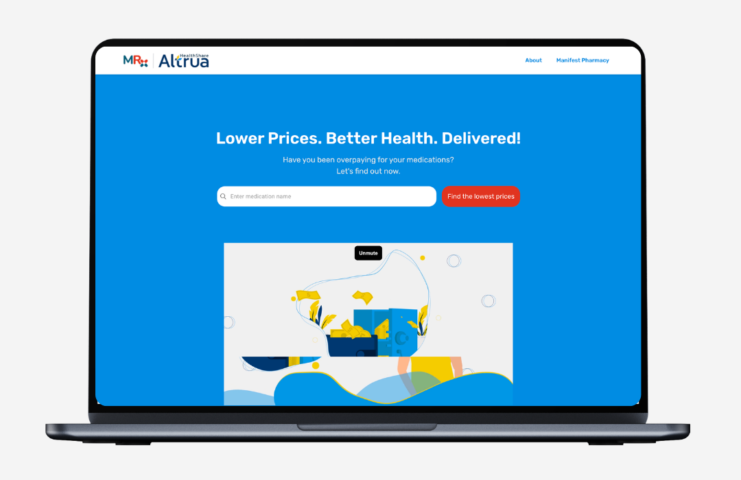
Before I got here, every asset started from scratch. No system, no shared visual language, and a growing family of brands with nothing connecting them.
-
Before
Manifest Pharmacy
-
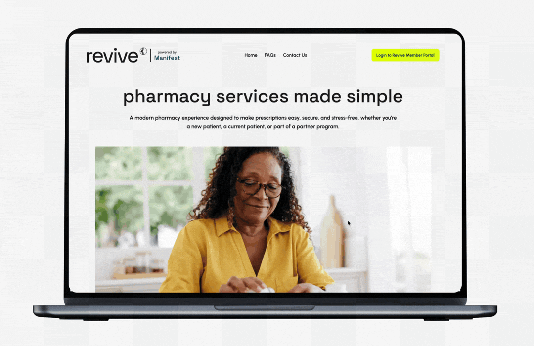
After
Revive powered by Manifest
the system
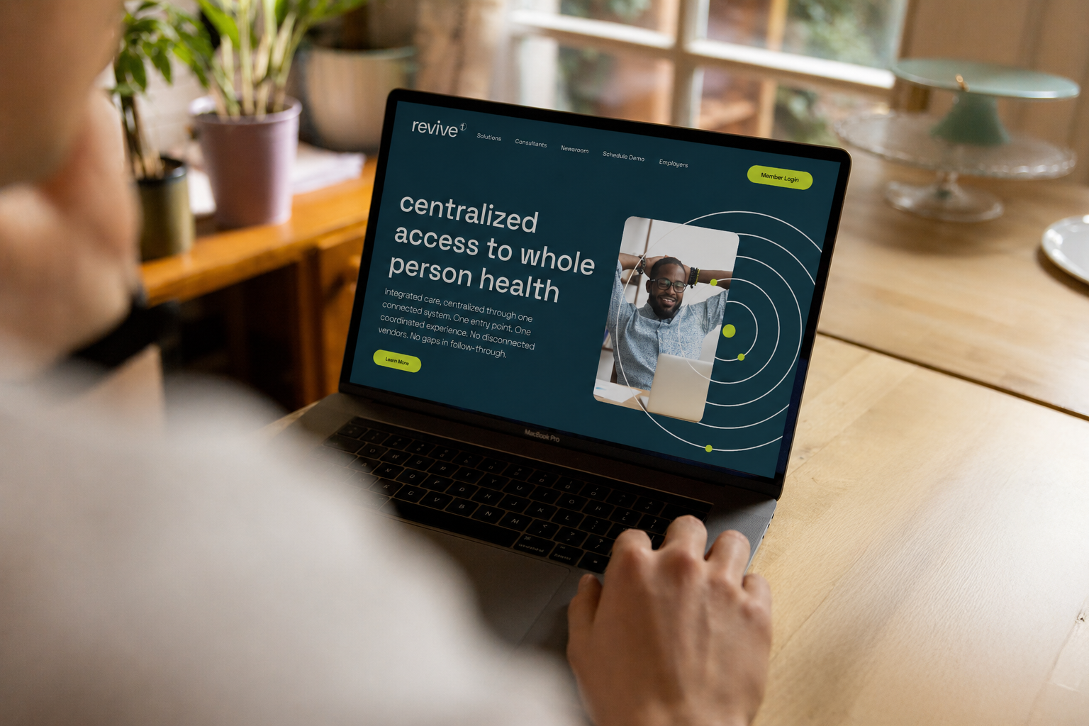
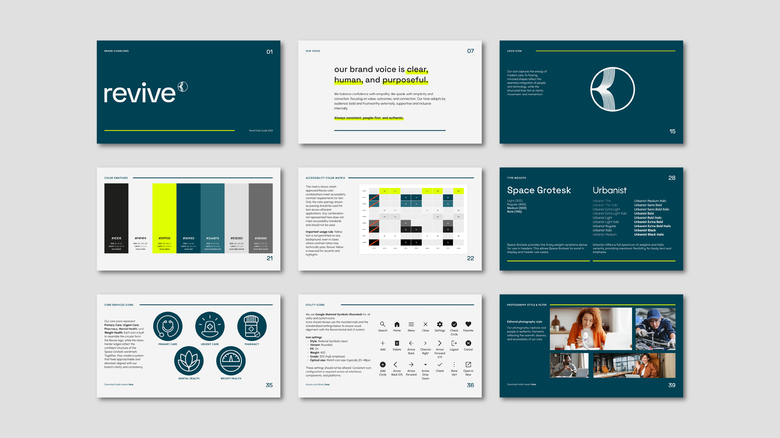
I built the visual language around one idea: Revive moves people from fragmentation to centralized care. Every element in the system encodes that story. Five elements. One language. Every graphic choice encodes a specific concept in the Revive story.
-
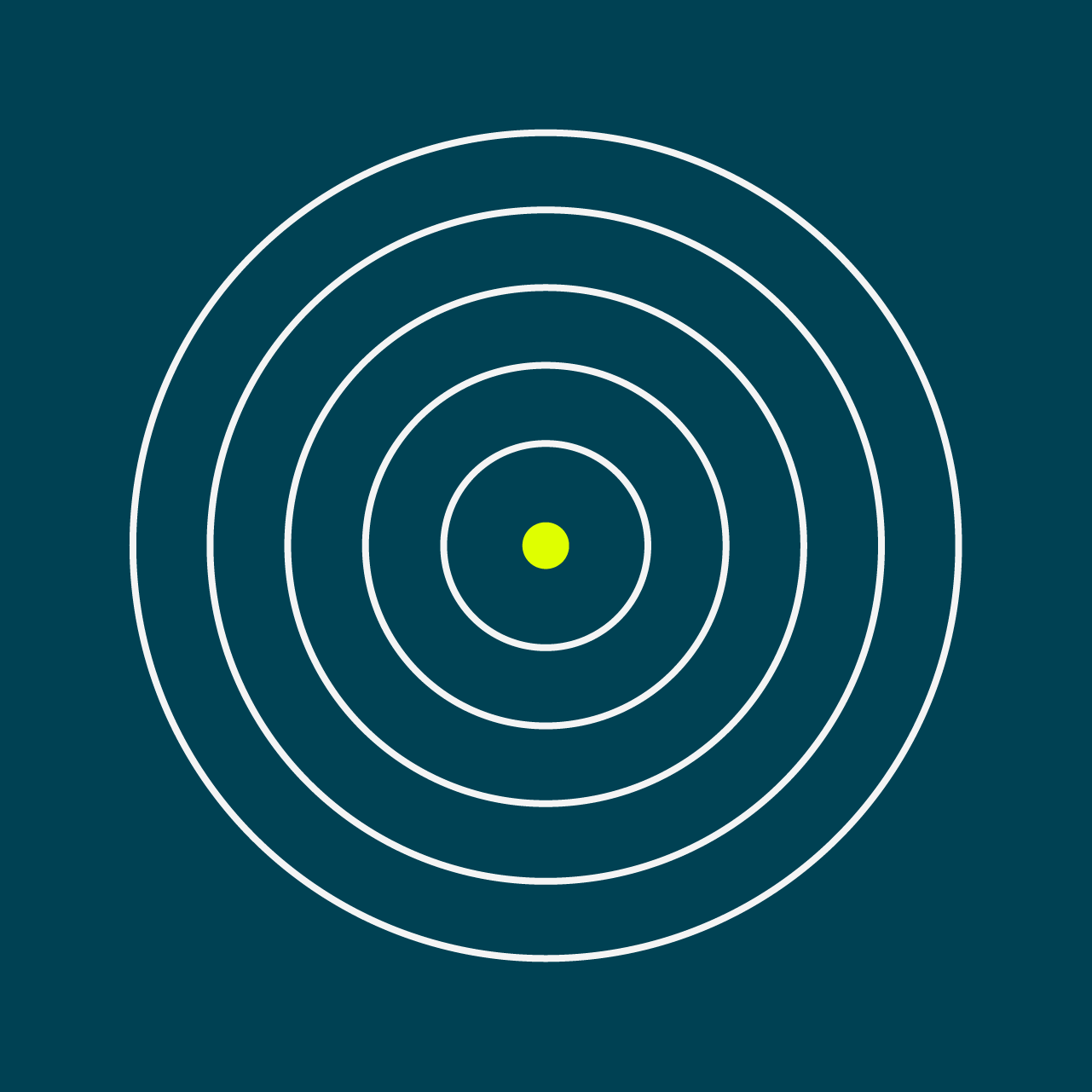
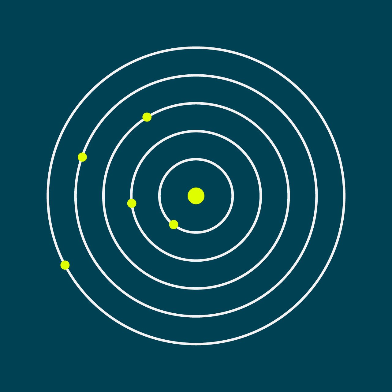
concentric circles
Centralized access and care
-
segmented circles
Fragmentation vs coordination
-

PIlls
Services within the system
-
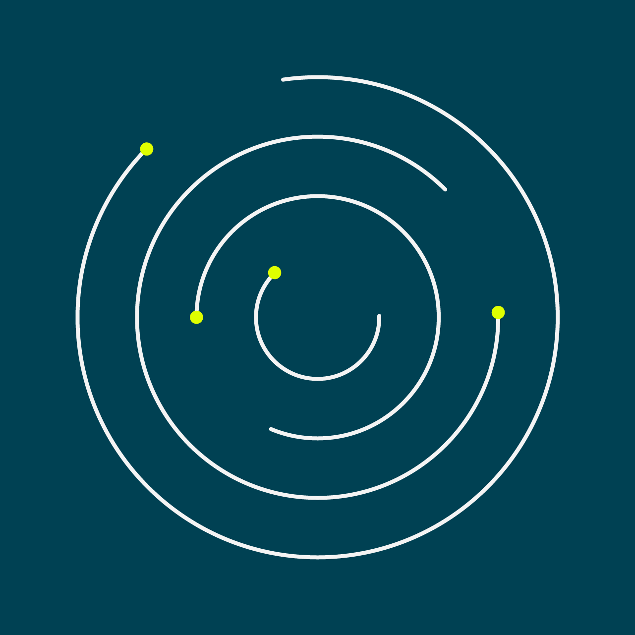
Orbit lines
Continuity and connection
-

Yellow lines
Impact, emphasis, hierarchy
THE VISUAL STORY ARC
The elements are the vocabulary. The arc is the grammar — defining which elements appear at each stage of the brand narrative, and why. The Visual Story Arc maps every asset Revive produces to a specific moment in the brand narrative.
Two Audiences, One System
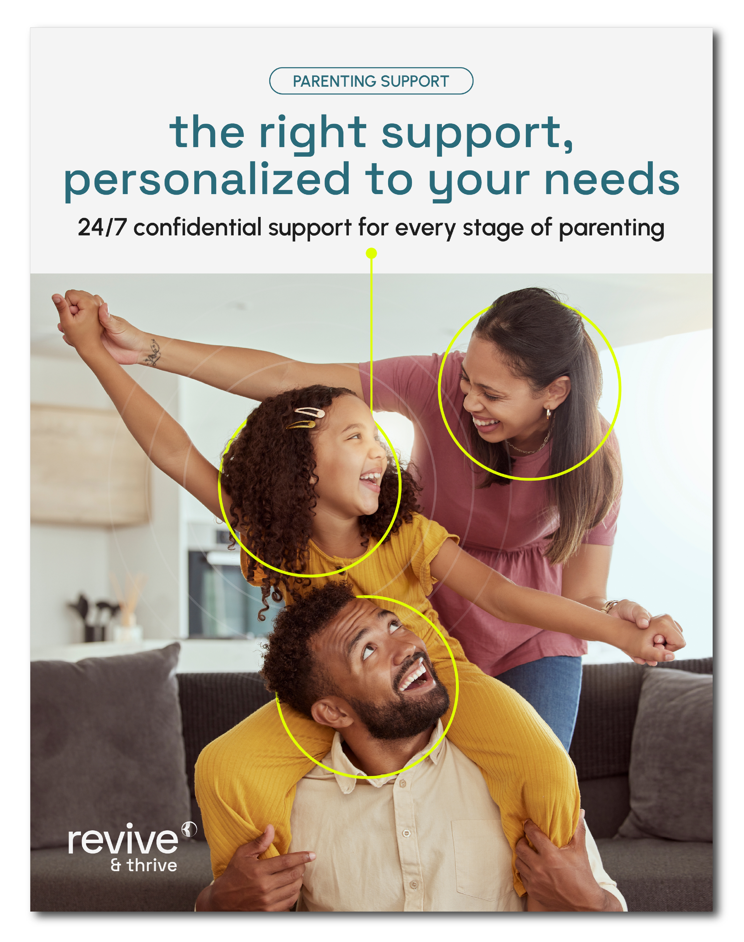
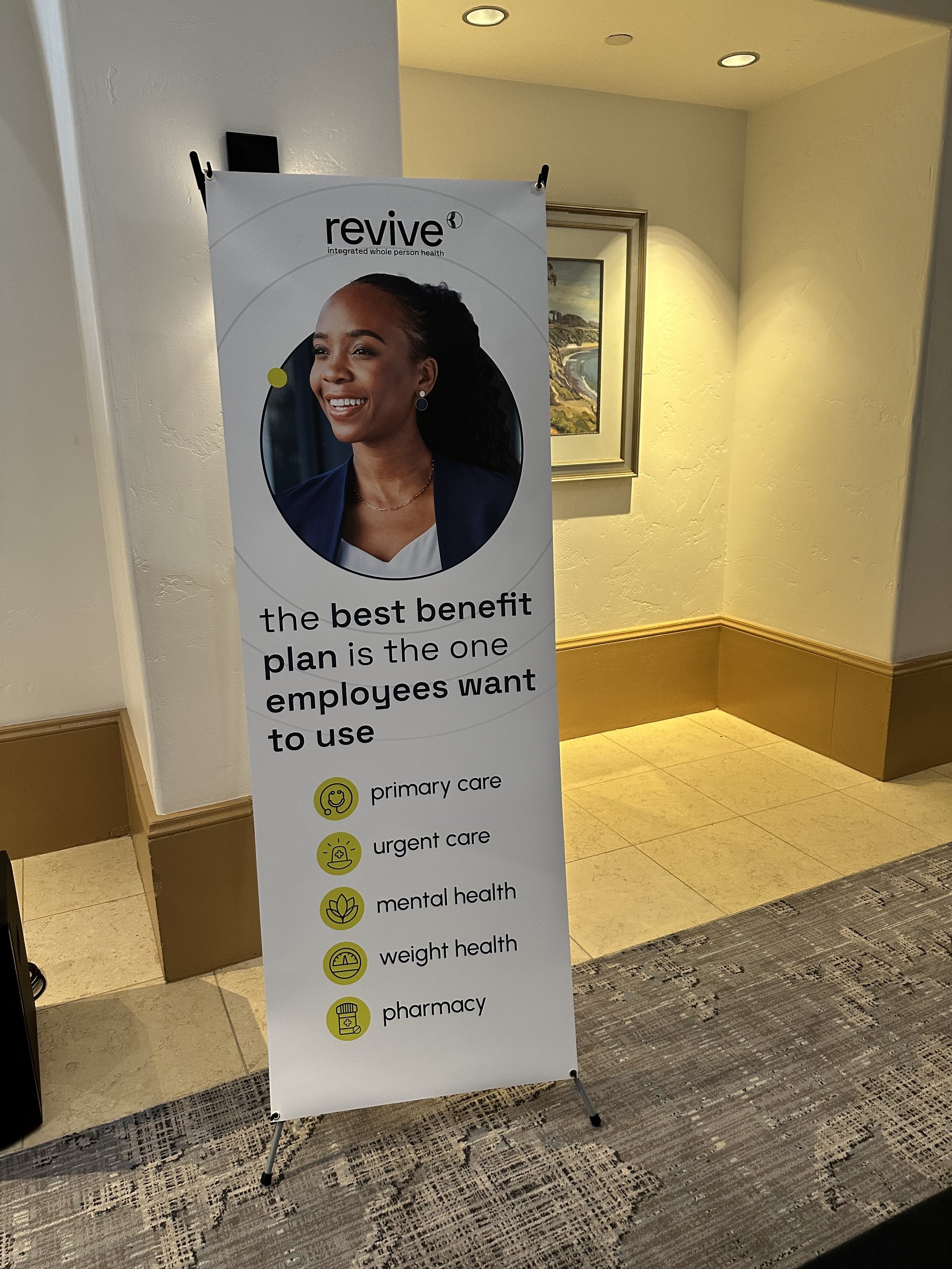
Revive speaks to two very different people — the employee navigating their health, and the employer making benefits decisions. I built a color distinction into the system itself so every asset knows who it's talking to.
-
Member-facing
-
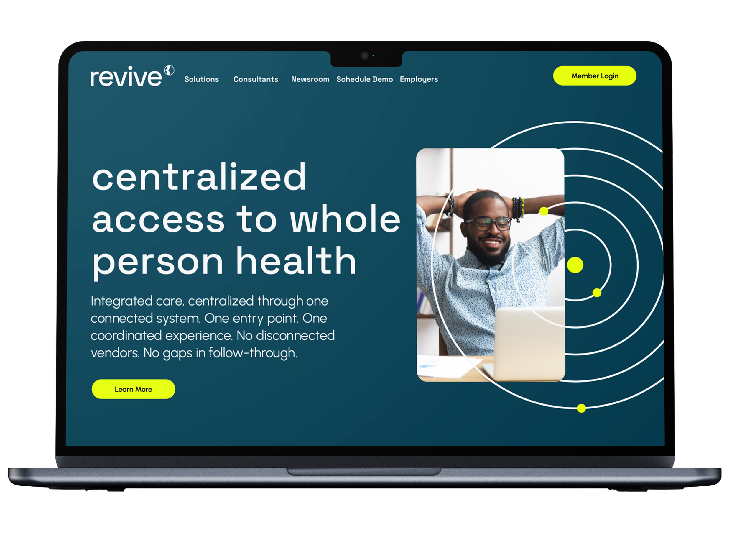
employer-facing
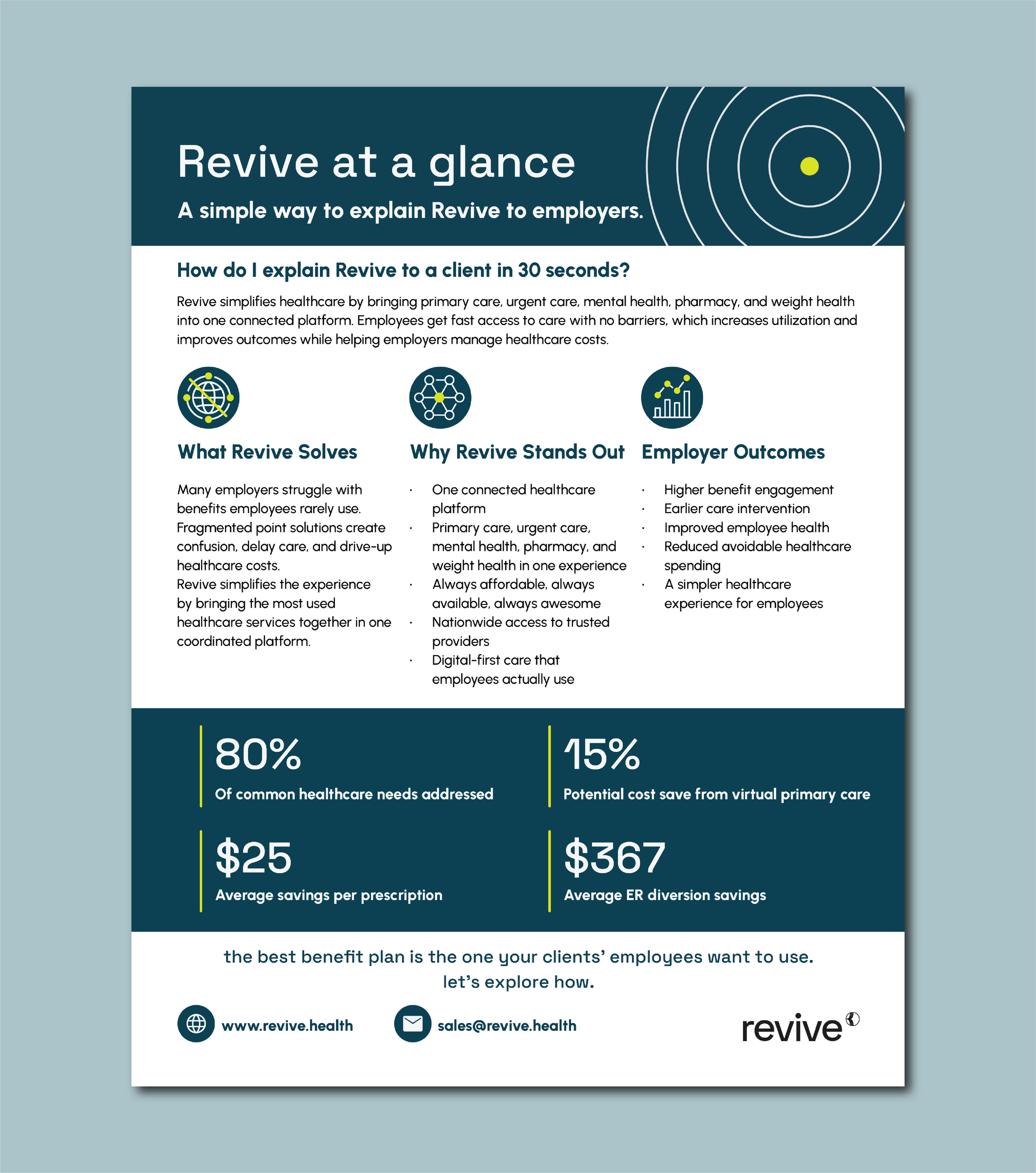
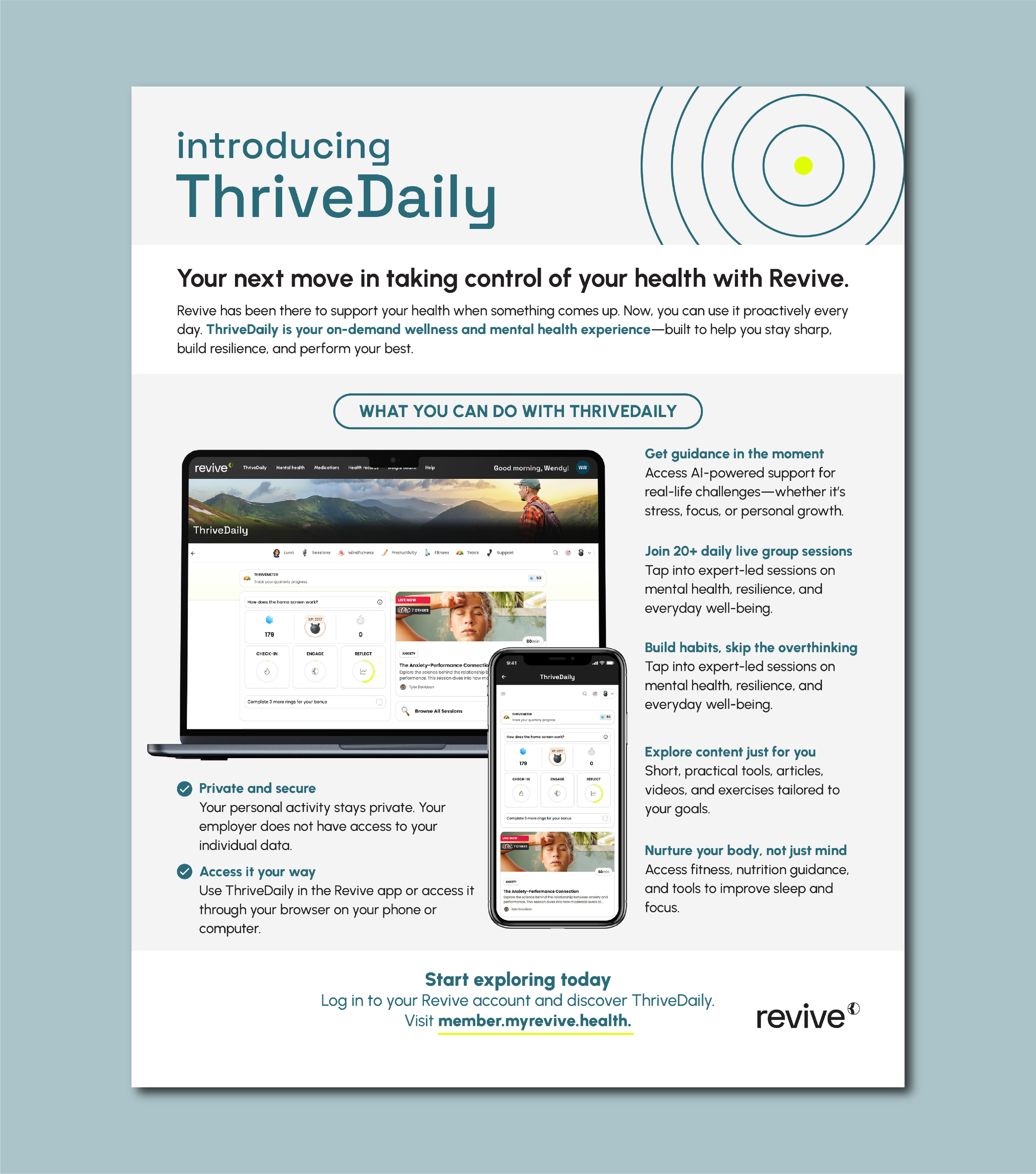
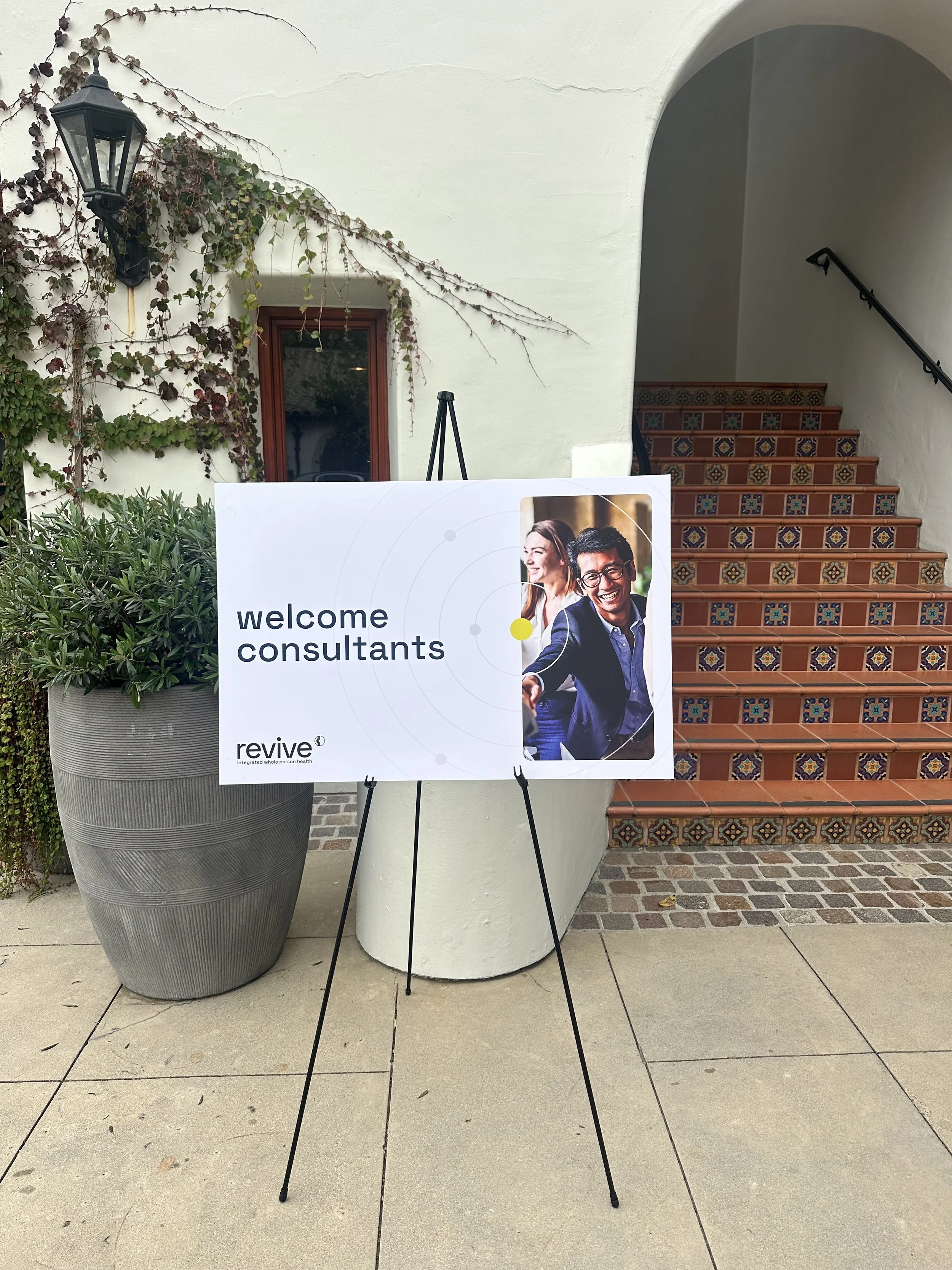
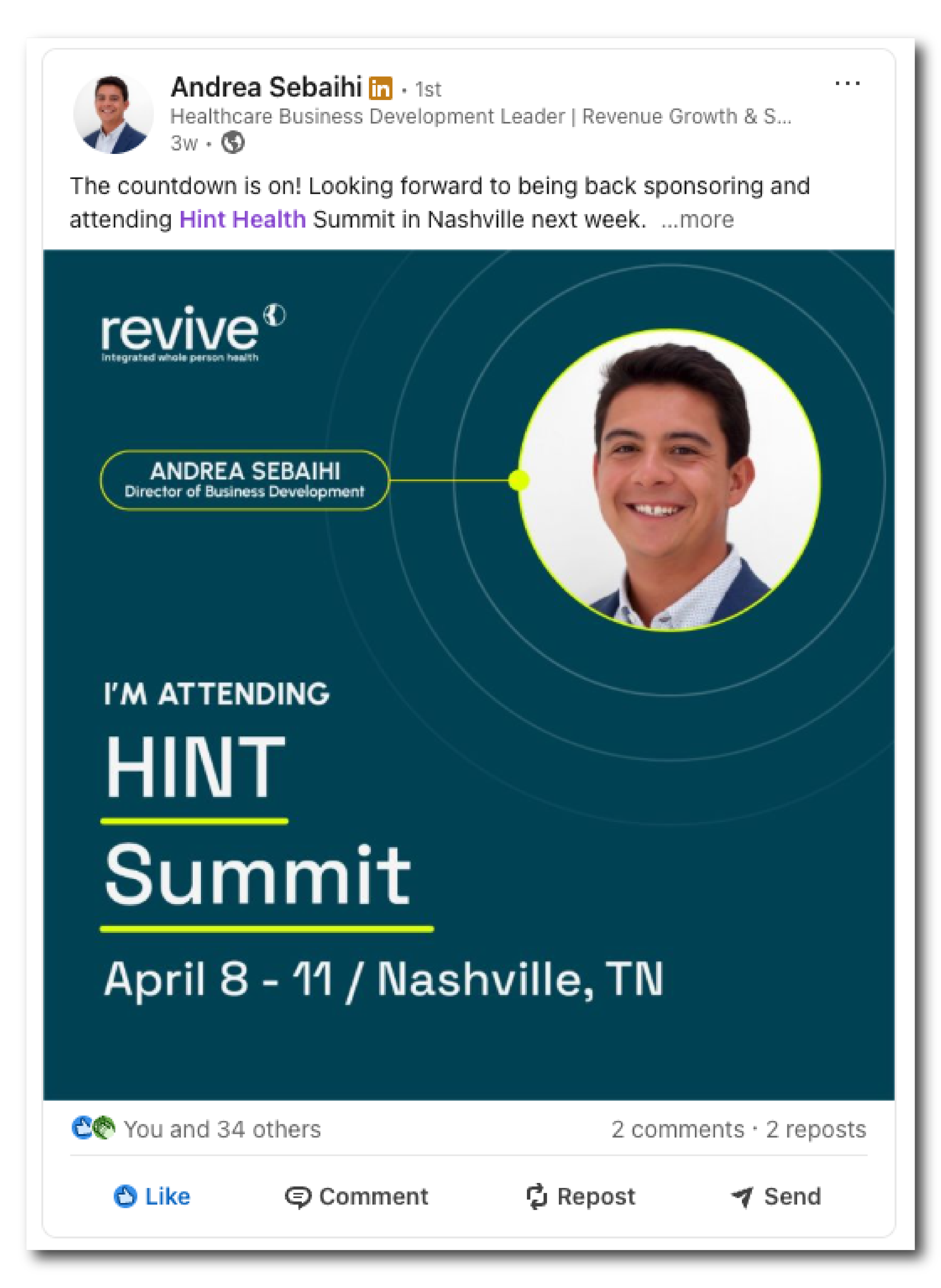
The System in Action
Deployed across marketing, sales, and customer success — every asset mapped to a moment in the story.


THE BRAND GUIDE
I developed a comprehensive brand guide with the new brand direction.
The Results
MORE WORK