BRAND IDENTITY • ILLUSTRATION
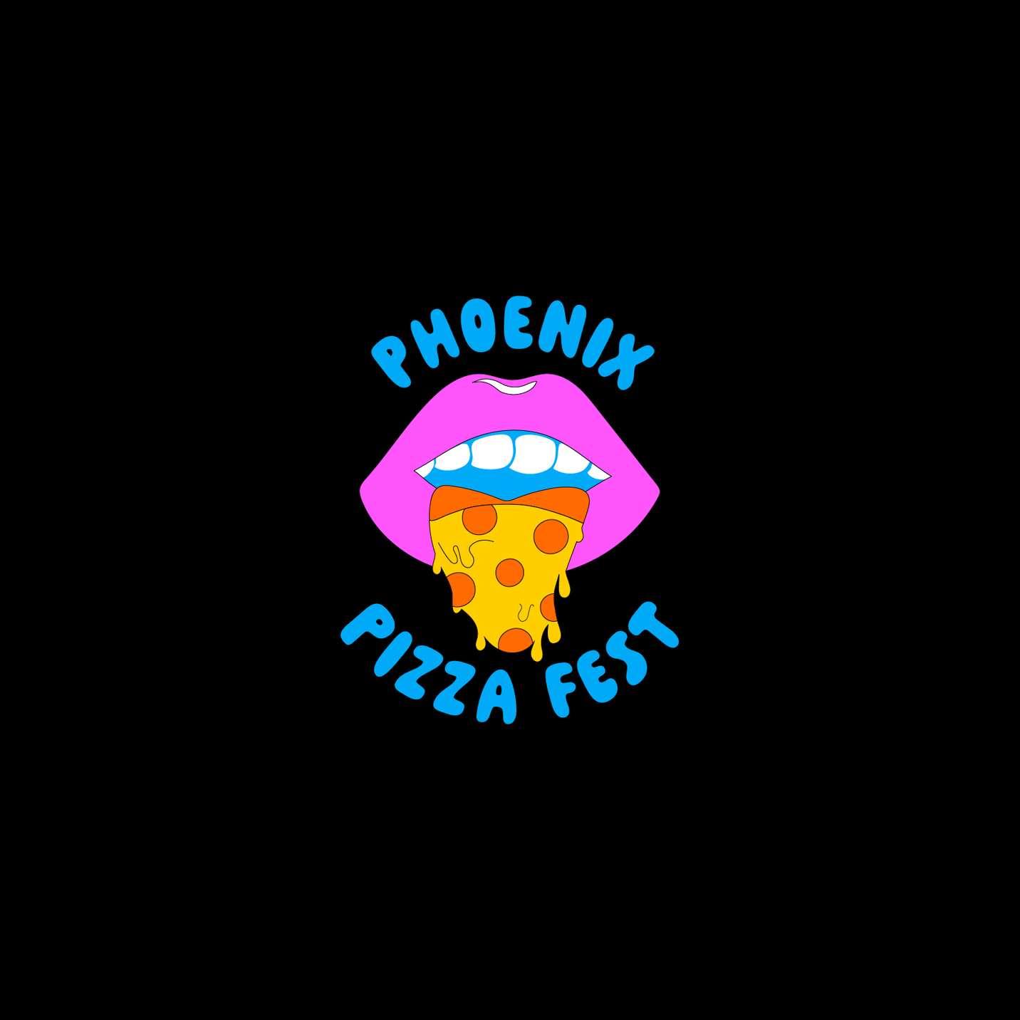
phoenix pizza fest
Big energy. Real results.
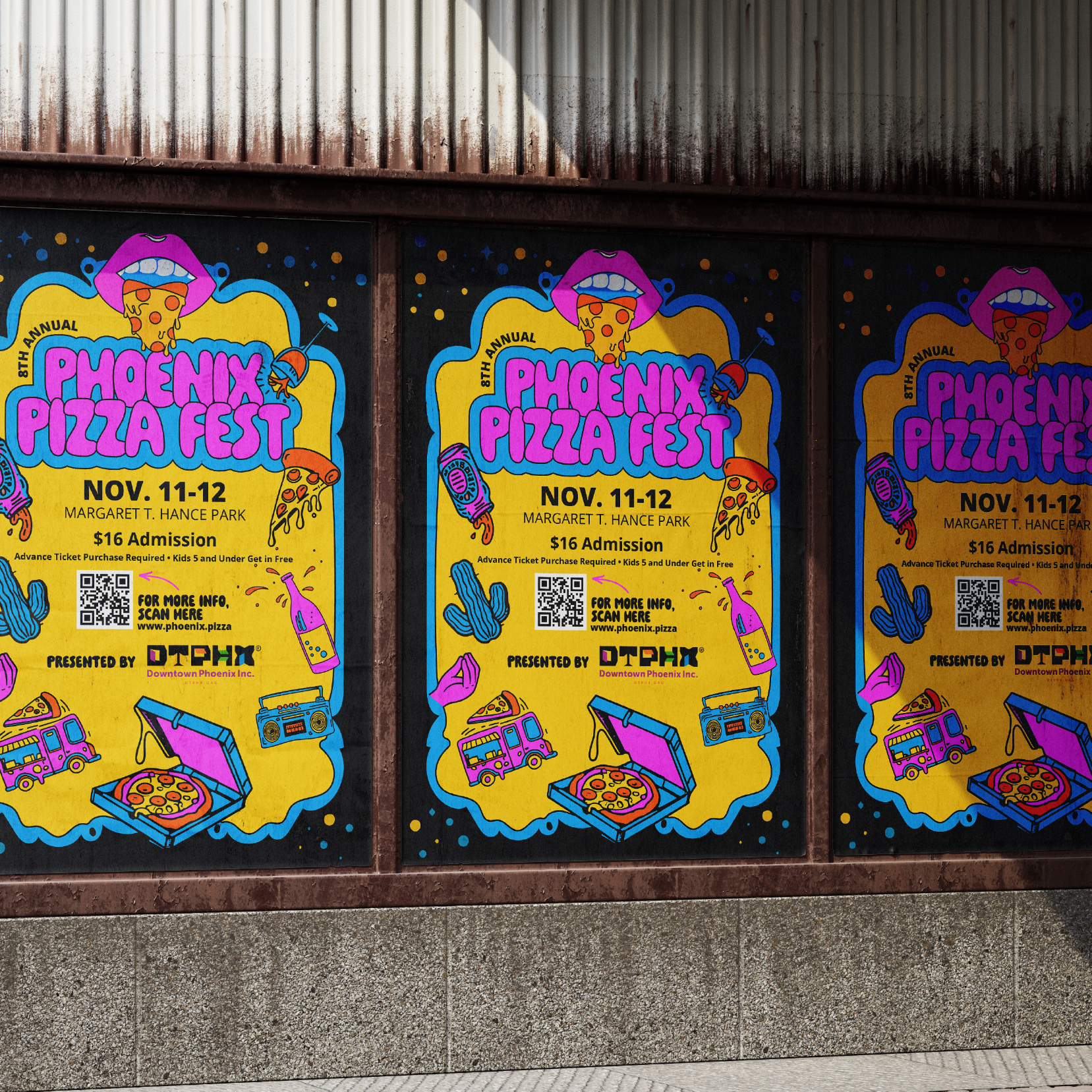
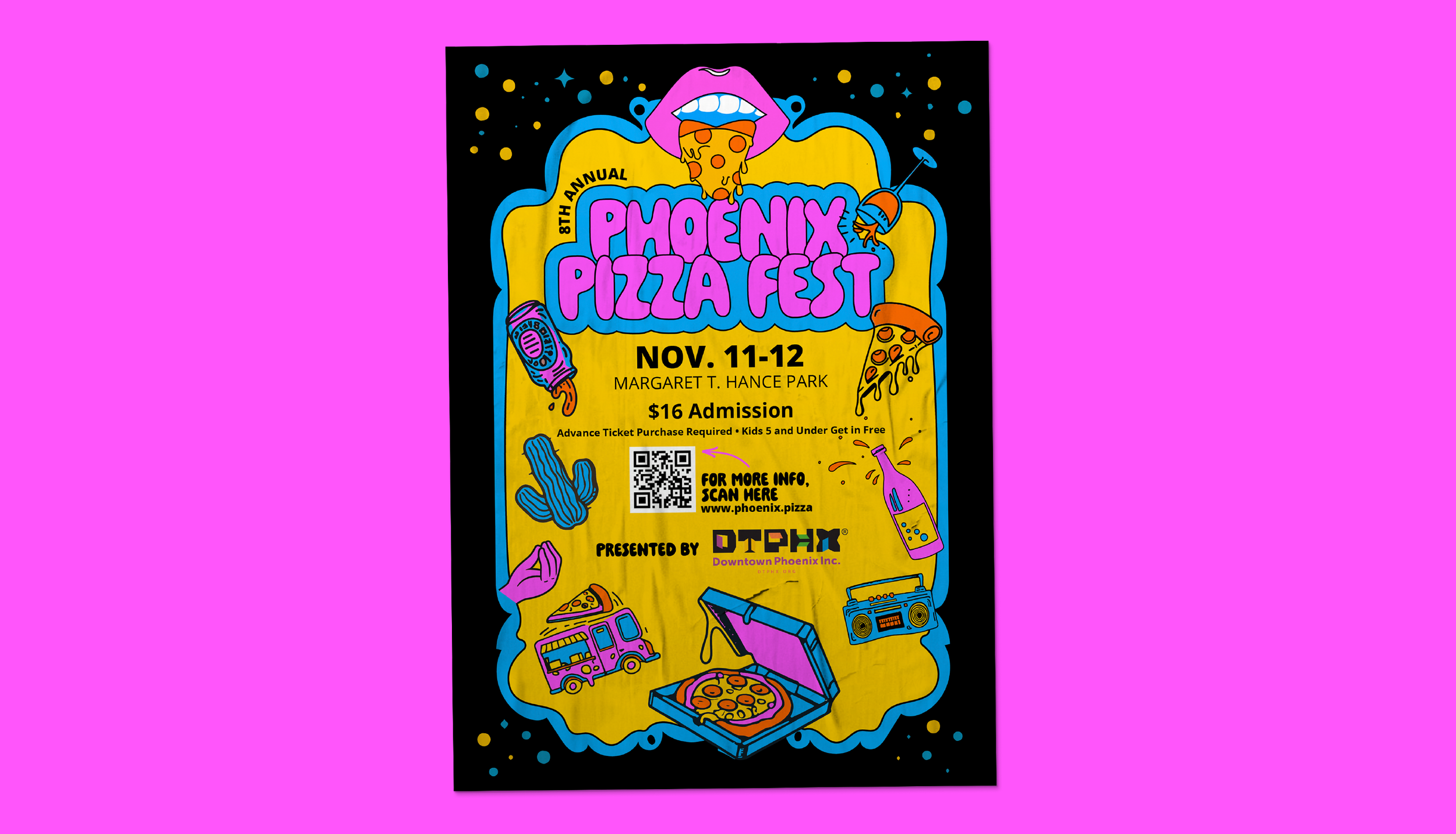
PHX Fest came to me to revamp their annual food festival series — starting with Pizza Fest. The ask was bold colors, playful illustration, and pop-art energy that could make a local culinary event feel like something you couldn't miss.
-
client
PHX Fest — Lisa Duffield + David Tyda
-
my role
Creative direction, brand identity, illustration
-
the brief
Bold colors, playful illustration, pop-art energy
the rebrand
The brief was to modernize the festival's identity while keeping the DNA of what made it recognizable. I developed a new logo that retained the spirit of the original — including a pizza-slice tongue as a playful nod to the culinary focus — and pushed the visual language into bold pop-art territory. Bright colors, strong illustration, the kind of energy that makes you want to show up.